A full brand refresh for a Hungarian manufacturer of air-handling and fire & smoke protection equipment — turning a dated, cluttered logo into a confident AO monogram and a disciplined orange-and-charcoal system that signals engineering, safety and innovation.
Aeroprodukt has operated in its current form since 2015, manufacturing and distributing air-handling units and, above all, fire & smoke protection equipment — its focus product group. The engineering was modern; the identity was not. The brief: a logo redesign and a compact identity kit that could hold its own against international rivals.
The company sits in a technically demanding, highly competitive category. On the Hungarian market it competes against large international manufacturers, and the only real ways to stand out are innovation and price — so the brand had to read as credible, precise and forward-looking, never like a local workshop.
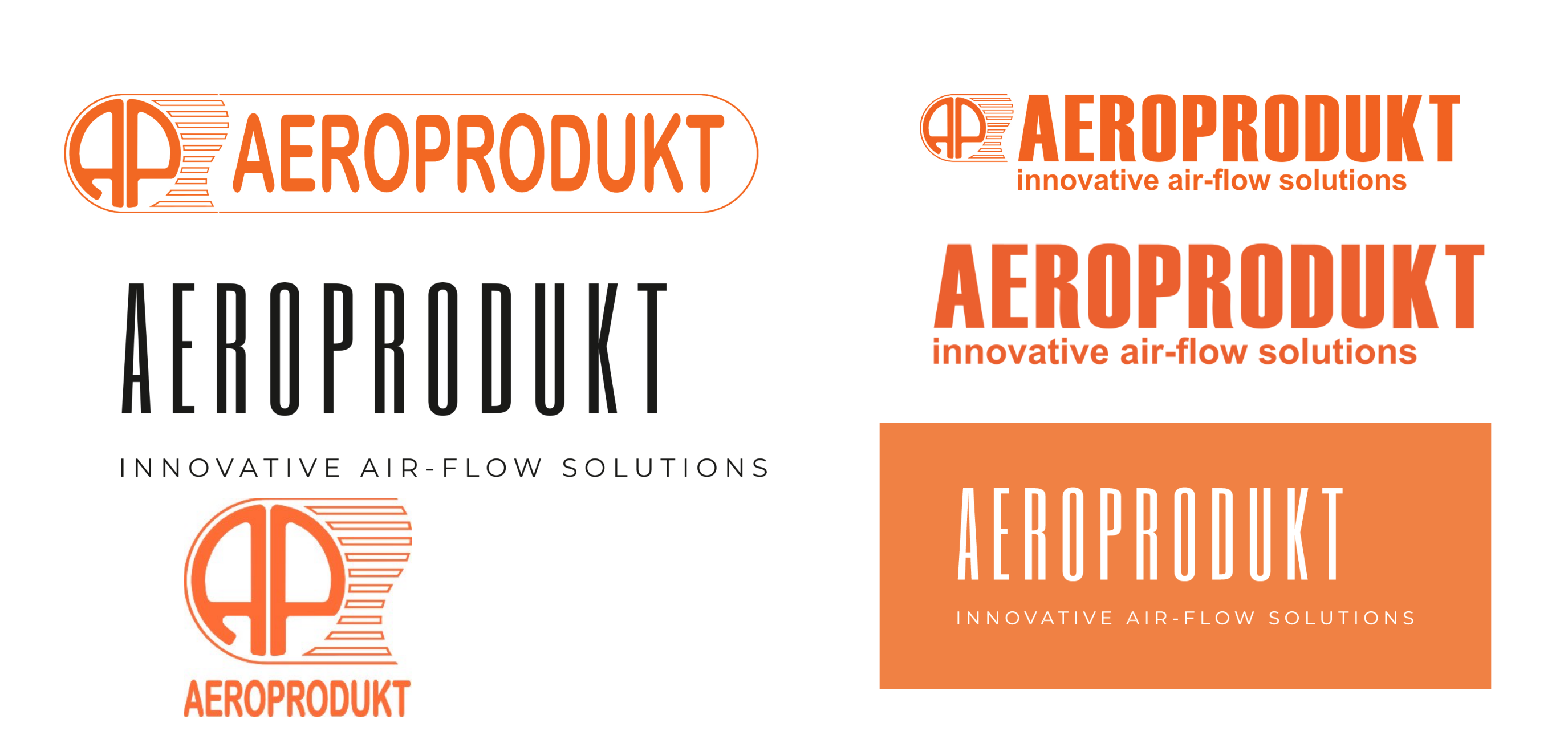
The existing logo did the opposite. A busy AP badge fused with speed-line "fins", an outlined pill container and an orange that drifted toward the generic — it felt like a 2000s equipment sticker, not the face of a manufacturer specifying into major building projects. My mandate was to keep what carried equity (the name, the orange, the air-flow idea) and rebuild everything around it with intent.
This case study focuses on the branding: the strategy that shaped the mark, the logo system and its core applications. It is a focused identity engagement, not a full web or product build — so the story stays on the identity, where the value was.
The old logo tried to say too much at once, and it lived in a category where every competitor already owns clean, confident corporate marks. Standing still wasn't an option.
An AP monogram, speed fins, an outlined pill and a wordmark all competed in one lockup. It never reduced cleanly to a favicon, a valve label or an embroidered polo.
The styling and the flat orange placed the brand a decade behind the engineering it represented — a credibility gap in front of specifiers who equate polish with precision.
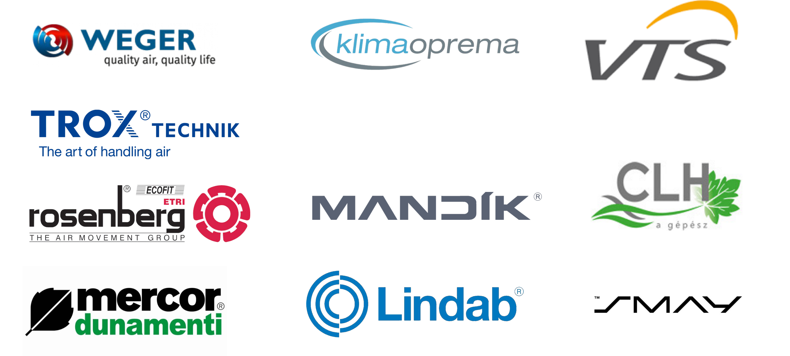
International players — Trox, Lindab, Rosenberg, Weger — show up with disciplined, single-idea logos. Next to them, Aeroprodukt looked like the smaller supplier.

Before The inherited system: an AP badge with speed-line fins, a pill-contained lockup and several flat-orange wordmarks. Functional, but busy, inconsistent and hard to scale.

The field Aeroprodukt is measured against — overwhelmingly cool blues and greys, clean geometry, restrained symbols. A warm, confident orange was both an equity to protect and an open lane to own.
Distil the brand into one ownable idea — air in motion — and build a precise, modern identity that reads as an engineering leader while keeping the orange that customers already recognise.
Before drawing anything, I anchored the identity in the brand's two personality archetypes and a single mandatory truth from the brief: the brand sells safety and expertise. The visual language had to feel protective and precise — warm, not cold; engineered, not loud.
The promise is care: "we look out for you." For a company whose focus is fire & smoke protection, safety is literally the product. The brand must feel dependable, generous and reassuring — persuading through trust, never aggression.
The second promise is wisdom: "with us you gain new knowledge." Aeroprodukt's buyers are engineers who value information, openness and progress. The brand can be considered and precise, using clear, elevated, confident design to earn their respect.
"Safety is the product. The brand has to feel protective and human."
Kept the warm orange as the heart of the identity and paired it with a solid, grounded charcoal — approachable warmth over clinical blue, so the brand feels like a protector, not a parts catalogue.
"Specifiers respect precision. Say one thing, and say it exactly."
Reduced the brand to a single idea — rising, circulating air — expressed in one geometric AO symbol with clean construction, so the mark reads as engineered and self-assured at any size.
Name "Aeroprodukt", the orange, the slogan and a short monogram version.
Honoured every required element — retuned the orange, retained "innovative air-flow solutions" as an optional descriptor, and designed the AO symbol as a standalone short-form for avatars, stamps and favicons.
Three directions were explored and presented; the client chose the route that fused the A and O of Aeroprodukt into a single, continuous symbol. It carries the whole brand idea — upward innovation and circulating air — in one clean geometric gesture.

A pure, elegant wordmark — tall condensed capitals, no symbol. Refined, but too quiet to flag the brand at a glance or work as an avatar.

A tidied take on the legacy AP + fins badge. It respected the equity, but still carried the enclosed, dated feel the brand needed to shed.

A single symbol fusing A and O — a rising peak meeting a circulating ring. One idea, infinitely scalable, unmistakably Aeroprodukt.

A sharp charcoal chevron points upward: ascent, progress and the engineering ambition at the core of "innovative air-flow solutions".
An open orange ring reads as both the O of Aeroprodukt and a loop of moving air — the product category made into a symbol.
Peak and ring weave through one another in a single unbroken stroke, so the eye follows a continuous path — air that never stops moving.
Charcoal for stability and trust, orange for energy and warmth — the Caregiver and the Sage held in a single, balanced form.

After The AO symbol sits above a reworked wordmark — AERO in charcoal, PRODUKT in orange — with the slogan locked underneath. One confident, scalable system in place of five competing ones.
A small, disciplined system: a retuned two-colour palette, a clean geometric type voice, and a full set of logo variants so the brand stays consistent from a laser-etched valve to a full-page advert.
Montserrat — a clean geometric sans — carries the entire system: Bold for the wordmark and headlines, Medium for the tracked lowercase slogan, Regular for technical copy. Its even, engineered geometry echoes the mark's construction and the precision the audience expects. One typeface, no decoration, used with discipline.


Delivered as a full kit — colour, monochrome and reversed, in horizontal, stacked and monogram forms — so the identity holds up across signage, product labels, documents and digital. On the brand orange (or any coloured field) the mark is always solid single-colour — full white or full black — never the two-colour version, which loses its orange against an orange ground.
Use the retuned Aero Orange exactly. It's the brand's most recognised asset and its clearest lane in a sea of blues.
Hold clear space around the lockup. The whitespace is the point — it's what signals the step up in quality.
No fins, gradients, glows, outlines or pill containers. The old busyness is exactly what we removed.
No off-brand colours, no distortion, no splitting the AO symbol from its construction. One system, used faithfully.
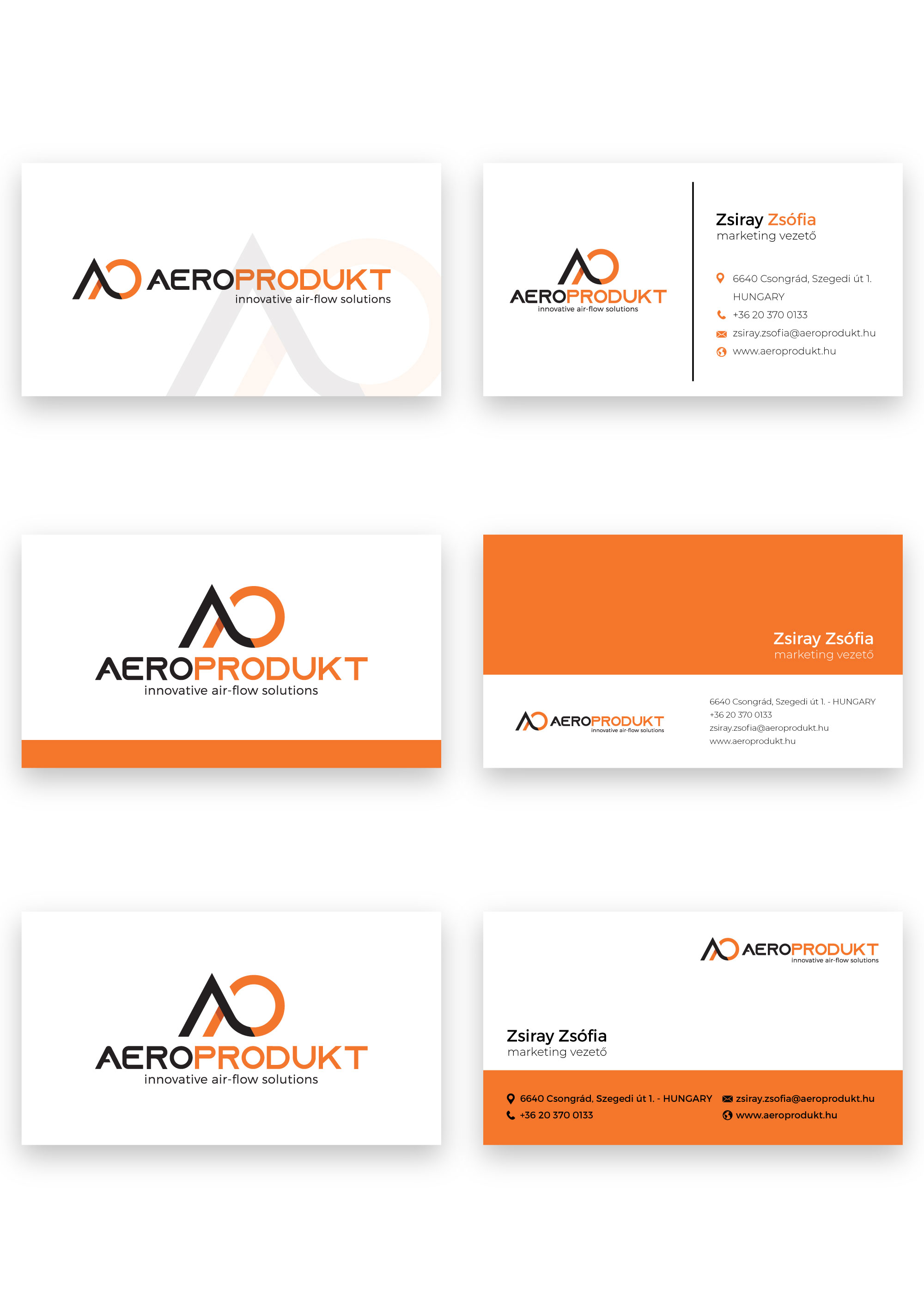
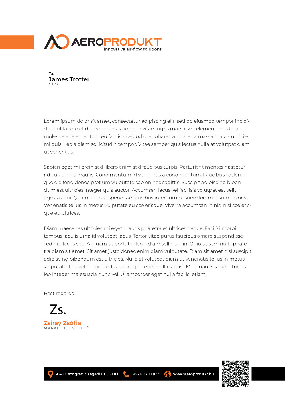
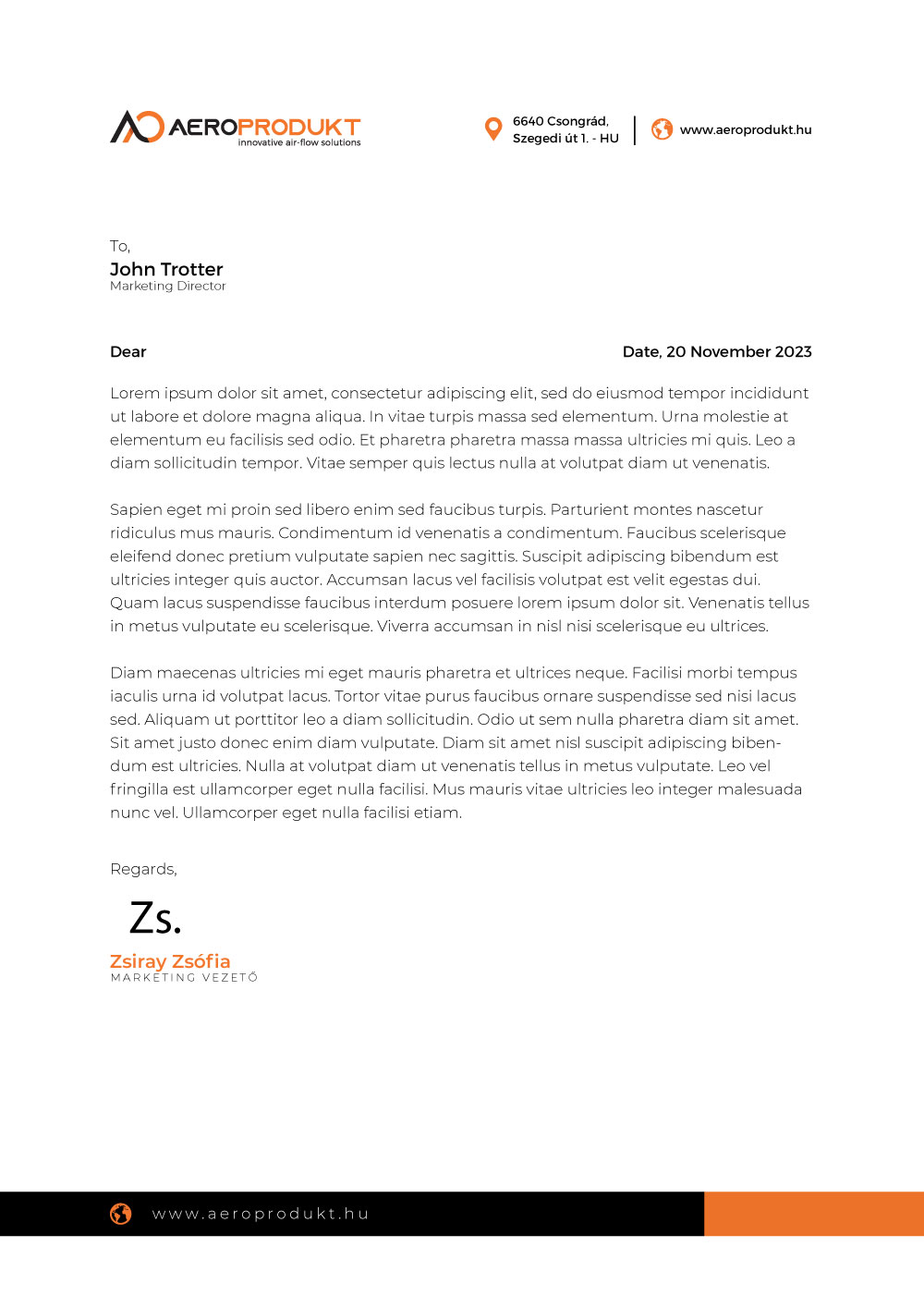
The brief called for a master business card and a letterhead — the two pieces that put the identity directly into a buyer's hands. Each uses the system's three moves: the AO symbol, the orange band and generous white space.

A flexible master card in three treatments — clean white, orange-banded and split-field — all driven by the same symbol, type and colour. The AO monogram works equally hard as a watermark, an accent and a corner stamp.


Two letterhead systems: one with a bold orange header tab and a dark contact footer, one with a lighter header and split footer band. Both keep the body copy clean and the brand present but never in the way.
Ajánlatkérés
Magyar mérnöki tudás, versenyképes áron — tervezőknek, kivitelezőknek és üzemeltetőknek.
A visualization of the identity on the web: the horizontal logo anchors a clean header, and the reversed mark carries a confident charcoal hero — the same three moves (symbol, orange, white space) running straight into the digital brand.
Reversed on building signage · etched on a product nameplate — the mark holds up from architecture to hardware
A dated, overloaded logo became a single ownable idea — air in motion — carried by a disciplined, scalable system. It was adopted as Aeroprodukt's identity and is in active use today, honouring every mandatory while finally matching the quality of what the company makes.
Adopted as Aeroprodukt's identity and in active use — across the website, business stationery, signage and product labelling — since its 2023 rollout.
The strongest industrial brands say one thing and say it precisely. Aeroprodukt's new mark says it in a single stroke — air, rising and circulating — and lets the engineering speak for the rest.