GABRIEL RADATOVICS · HOMEMED
PRODUCT LAUNCH SITE · WEB DESIGN

HOMEMED

A 7-in-1 home minilab — one device that measures seven lab values from a drop of blood. The launch site takes a clinical medical product and reframes it as modern, lifestyle health-tech: more sports-watch than hospital, built to turn curiosity into a sale.

TYPEProduct launch · marketing site
ROLELead Web / UI Designer
MADE FORContento
SCOPEArt direction → UX → UI
MARKETHungary · Hungarian
homemed.hu
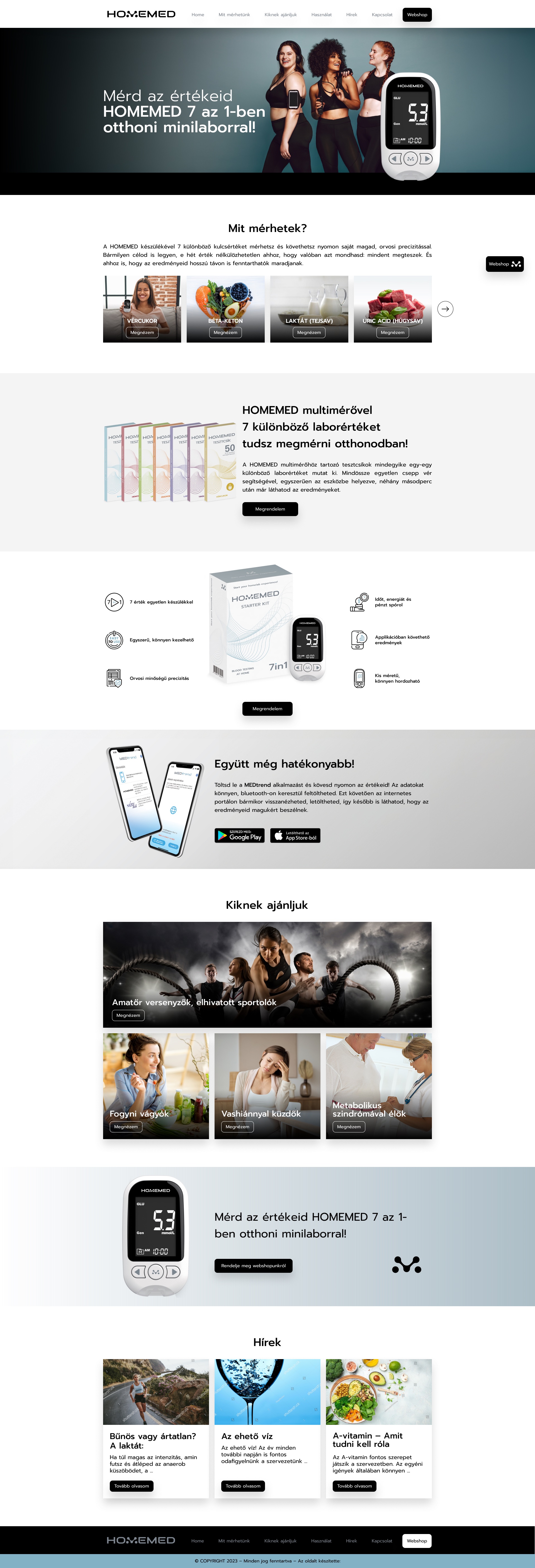
HOMEMED homepage — full page
Scroll inside the frame — full page
00
CONTEXT & ROLE

A New Category,
Not Just a Device

HOMEMED is a 7-in-1 multimeter: blood glucose, β-ketone, lactate, uric acid, total cholesterol, triglyceride and haemoglobin, each read with its own test strip. Nothing quite like it exists on the market — so the site isn't selling against competitors, it's introducing a category. The job was the brand's web home for that launch.

The device never sells on this site directly — homemed.hu exists to make people understand it, want it, and click through to the webshop. So every page is built around one movement: explain the product clearly enough that a visitor leans in, then hand them off to buy.

There was no brand book — only a logo. That gap was the opportunity: I set the art direction from scratch, deliberately pulling the product away from the clinical, hospital look of the category and toward the confident, modern feel of premium lifestyle and fitness tech.

MADE FOR
Contento (agency) · client HOMEMED
PRODUCT
HOMEMED 7-in-1 home minilab
MEASURES
7 lab values, one device
SITE GOAL
Explain & convince → hand off to webshop
POSITIONING
New category · no direct rival
STARTING POINT
Logo only — no brand guidelines
BUILD
Custom WordPress development
WHAT I OWNED
Art DirectionUX & Content StructureLanding-Page Design UI & Visual DesignCampaign FunnelsDev Hand-off
01
THE CHALLENGE

Make a Lab Device
Feel Like Lifestyle

Selling a brand-new kind of product is hard three ways at once: people don't know they need it, the obvious visual language makes it look clinical and dull, and several very different audiences each need a different reason to care.

AWARENESS

Nobody's searching for it

With no established category, demand is latent. The site has to create the want — show people a reason to measure themselves they hadn't considered — not just satisfy an existing search.

PERCEPTION

Clinical reads as boring

Default "medical device" styling is cold and forgettable. For a lifestyle audience it had to feel aspirational — closer to a fitness wearable than a glucometer.

AUDIENCE

Four people, one product

Athletes, dieters, iron-deficient women and people managing metabolic syndrome all buy the same device for completely different reasons — and each needs its own entry point.

DESIGN OBJECTIVE

Give a clinical device a confident, lifestyle identity, and build a site that explains a brand-new category clearly enough to turn latent curiosity into a click to buy.

02
WHO WE DESIGNED FOR

Four Reasons
to Measure

The brief named a lifestyle-led mainstream and a health-led secondary audience. Rather than average them into one grey message, the site gives each its own landing page with its own argument — and shows only the measurements that matter to them.

01

Athletes & gym-goers

Bodybuilders, CrossFit and TRX, 18–39. Already buy gear and supplements. The hook: know your own body and train smarter. Track glucose, ketone, lactate, uric acid.
02

Dieters

18–49, trying to lose weight — often cutting food over moving more. The hook: measure what's actually happening and build a plan that works.
03

Iron-deficient women

Many don't know they're deficient until a clinic tells them. The hook: catch it early at home with regular haemoglobin readings.
04

Metabolic syndrome

Middle-aged, managing cholesterol, triglycerides and glucose. The hook: watch your biomarkers and head off a metabolic spiral.

“One device, four audiences. The site's job was to let each one feel the product was built for them.”

03
ART DIRECTION

Obsidian, Steel
and Daylight

The direction takes its cue from premium sports-tech — think a fitness watch's product page, not a pharmacy shelf. Deep obsidian heroes with lifestyle imagery and the device packshot, cut against clean daylight content, with a cool steel-blue carrying every call-to-action.

COLOUR
Obsidian
#0C1213
Deep Steel
#245A6E
Steel-Cyan
#2F8299
Bright Steel
#79C0D4
Daylight
#EDF1F2

Dark where it sells

Hero and CTA bands go obsidian with lifestyle photography and a spotlit packshot — the device reads as a desirable object, not a disposable.

Light where it teaches

The explaining — what it measures, how it works, who it's for — happens on bright, airy sections, so dense health content stays effortless to read.

Steel is the signal

A single cool steel-blue marks every action, from "add to cart" to "learn more," so the path to the webshop is always the same colour.

04
THE PRODUCT

One System,
Every Page

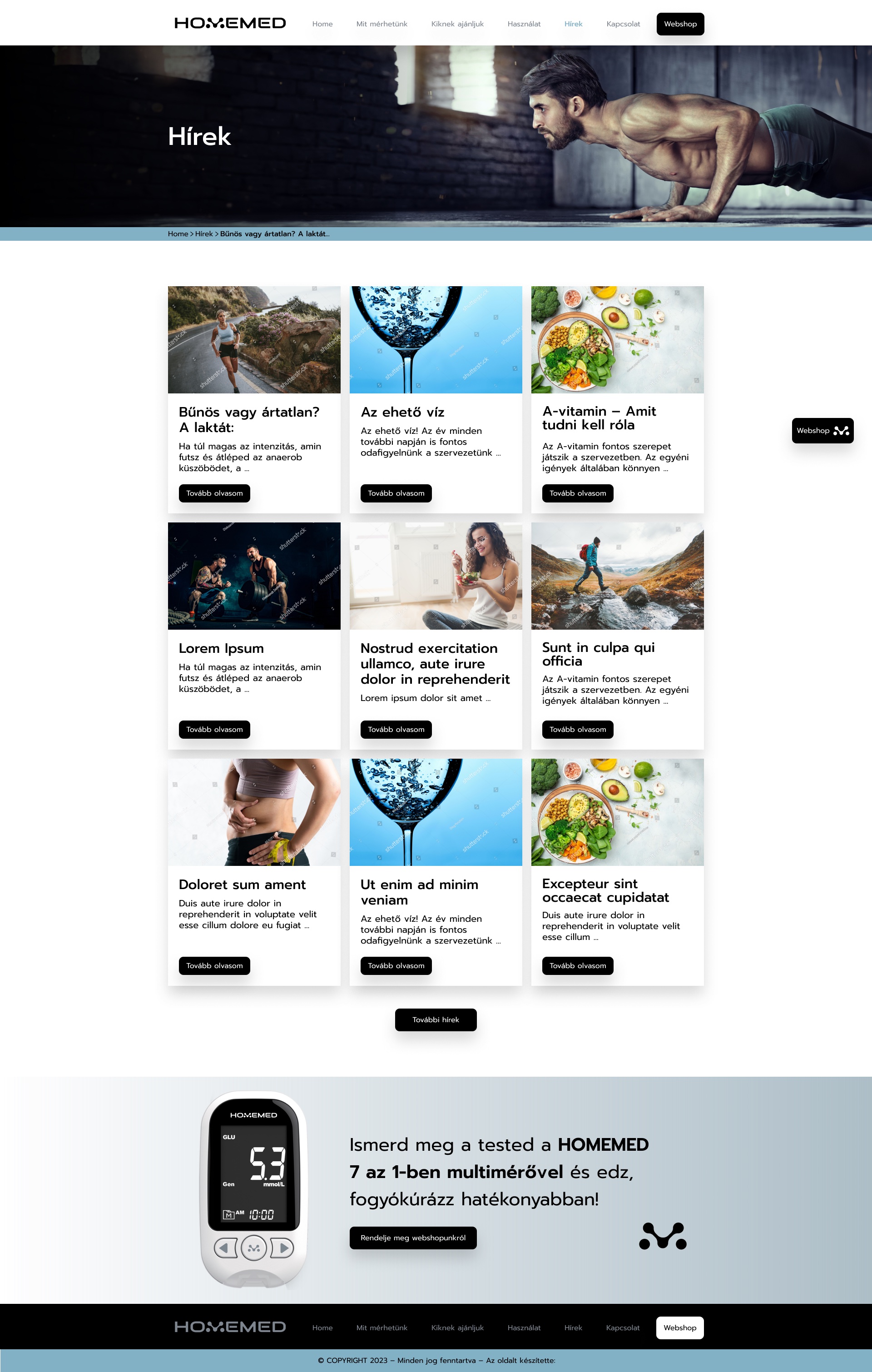
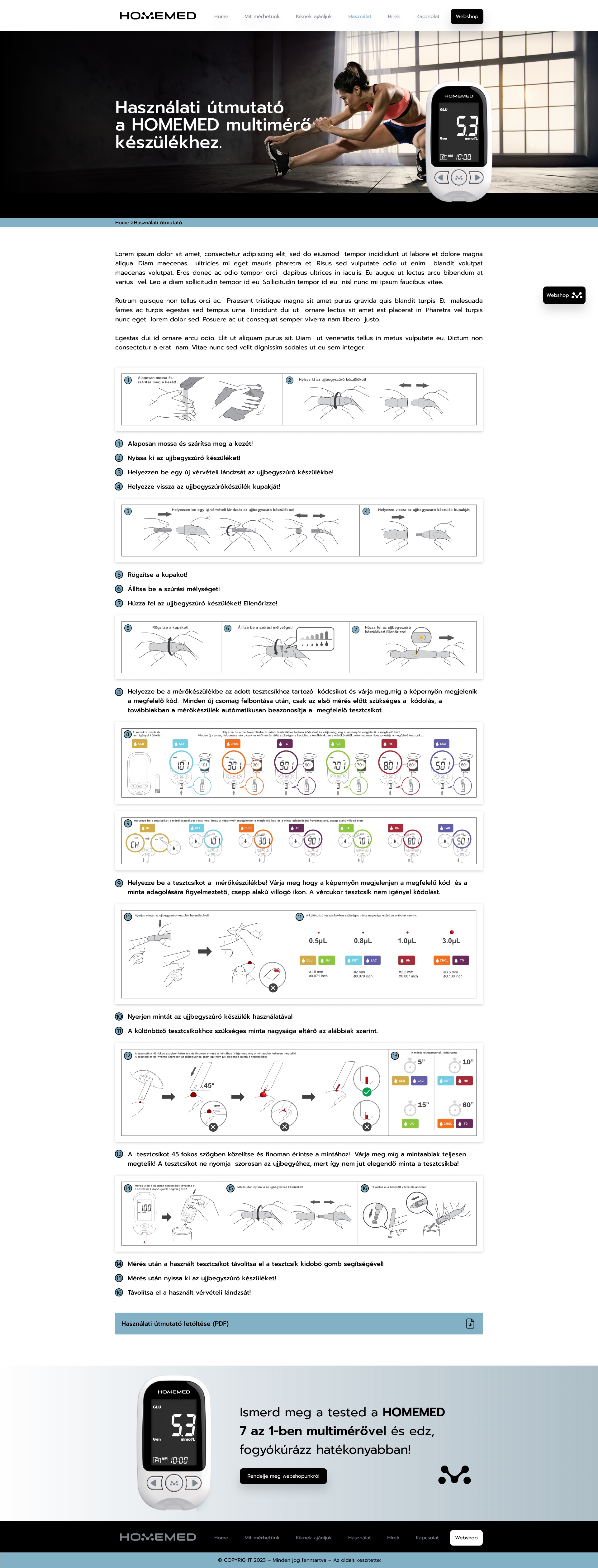
The same obsidian-and-steel language carries the whole site — the homepage, the "what can I measure" system, the campaign landing pages and news. Each frame below is the complete page; scroll inside it.

05
DEEP DIVE · WHAT CAN I MEASURE

Seven Values,
One Template

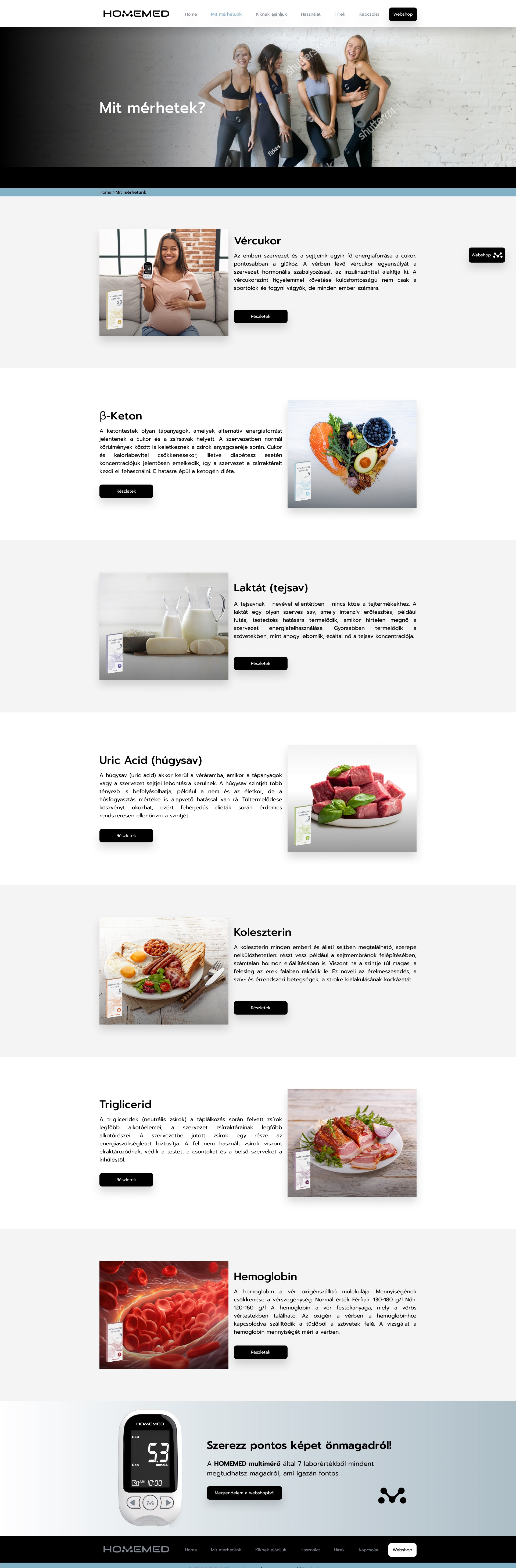
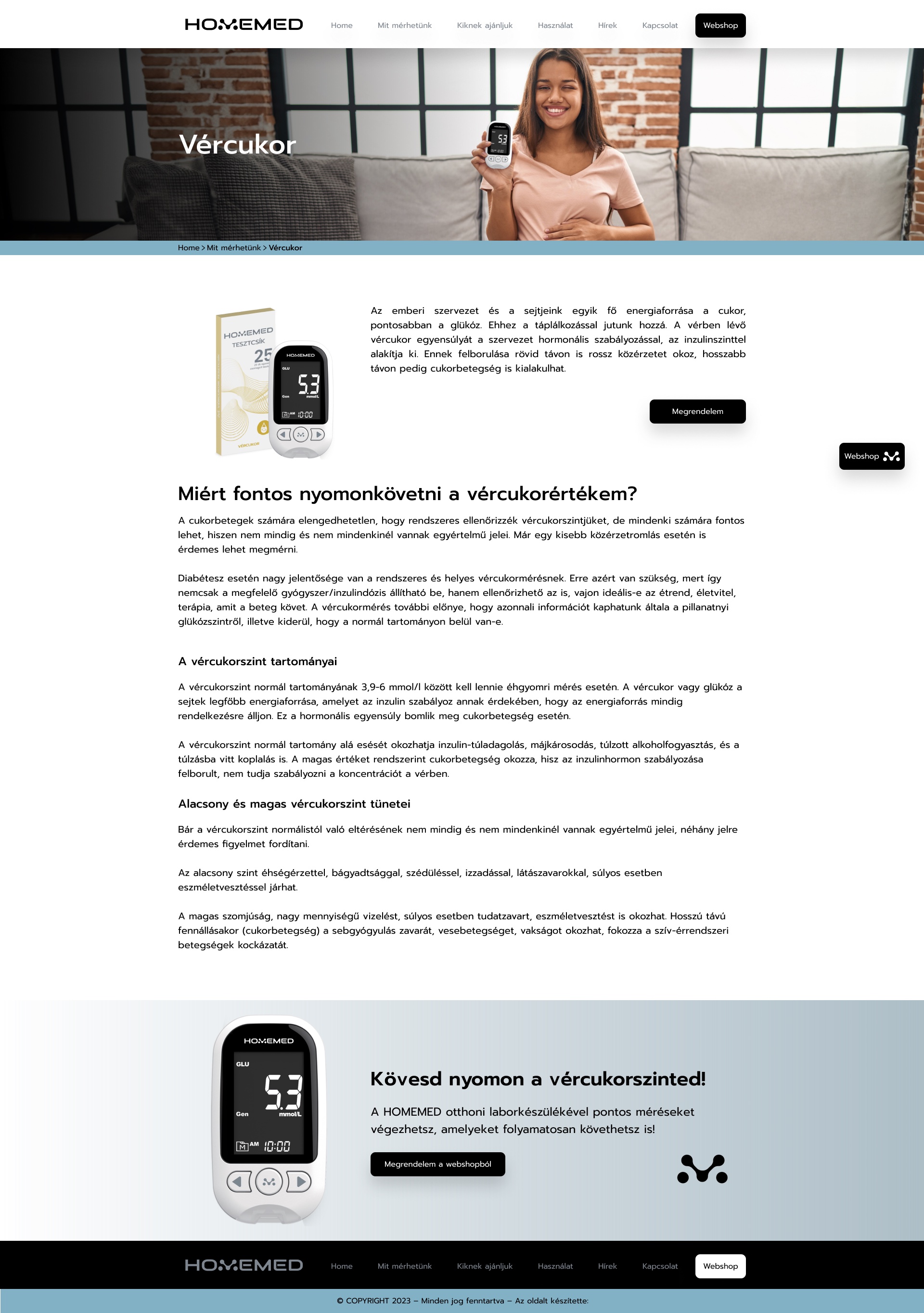
The heart of the site is education: seven lab values, each needing its own explainer. The content differs wildly, so I built one visual template that holds any of them — what the value is, why you'd track it, and how to read the result — so a reader always knows where to look.

THE SEVEN VALUES
Blood glucoseβ-ketoneLactateUric acid Total cholesterolTriglycerideHaemoglobin
ONE REPEATABLE STRUCTURE
1

What the value is

A plain-language definition opens every page, so a newcomer grasps the parameter before any numbers appear.

2

Why it's worth knowing

The reason to care — tied to training, weight, energy or long-term health — turns a lab figure into a personal signal.

3

Normal · high · low

A consistent reference block shows the healthy range and what a reading above or below it means, with the matching test-strip packshot alongside.

4

Buy from the webshop

Every page closes on the same steel call-to-action — the device and the right strips are one click away.

06
DEEP DIVE · CAMPAIGN FUNNELS

A Landing Page
per Audience

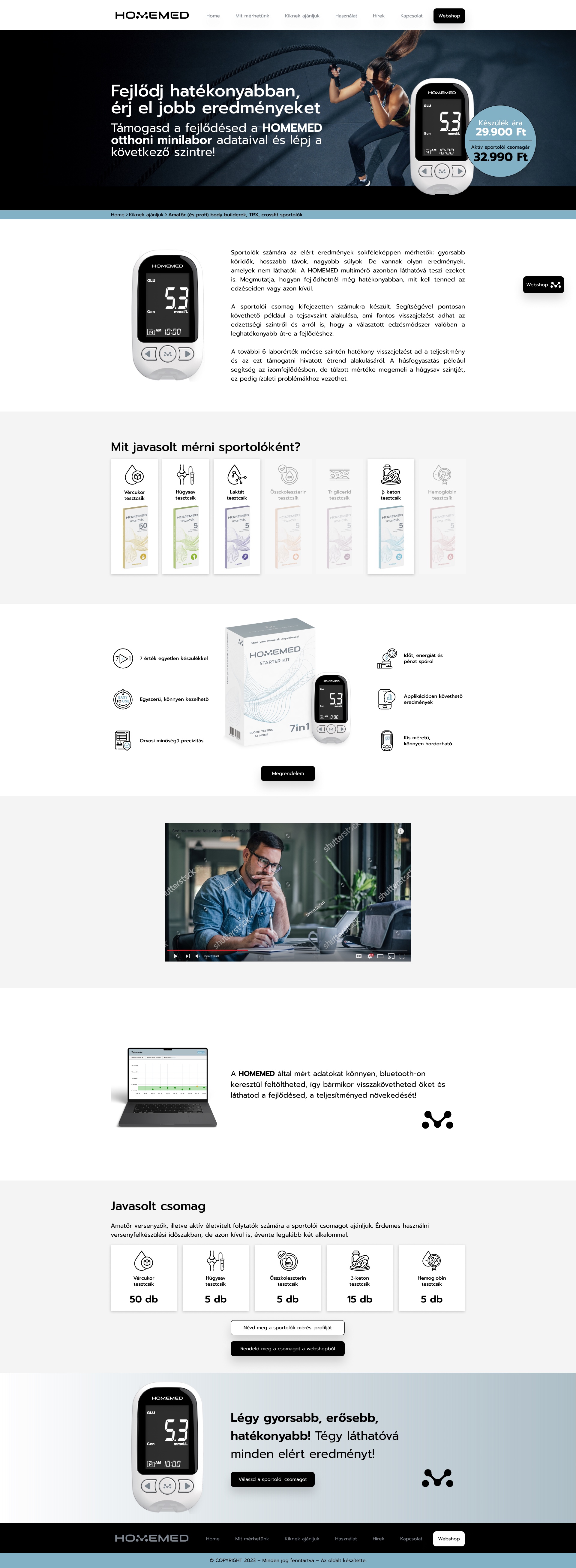
Paid campaigns can't point four different people at one generic homepage. Each priority audience gets its own landing page — same structure, different argument, imagery and a tailored "recommended package" of test strips — then funnels straight to the webshop.

Same frame, different story

One landing template, re-skinned per audience — fast to extend to the next campaign without redesigning the funnel each time.

Always one click from buying

Because the site never sells directly, every page is engineered to end in the same place: a confident hand-off to the webshop.

07
SCOPE & OUTCOMES

What the
Work Delivered

A complete brand-led launch site that repositions a clinical device as desirable lifestyle tech, explains a brand-new category, and routes four distinct audiences toward one goal: the webshop.

7
Lab values
one device, one template
4
Audience funnels
campaign landing pages
1
Art direction
built from a logo alone
100%
Conversion-led
every page ends at buy

Repositioned, not reskinned

Took a medical device out of the clinical bracket and gave it a modern, lifestyle identity that an athlete or a dieter actually wants to be seen with.

A category made legible

Turned seven unfamiliar lab values into one clear, repeatable explainer system that teaches without overwhelming.

Built to convert

Audience funnels and a single, consistent call-to-action channel latent curiosity straight to the webshop.