GABRIEL RADATOVICS · MEDTREND
HEALTH-TECH PLATFORM · UX / UI REDESIGN

MEDtrend

A Hungarian diabetes-care platform for Di-Care Zrt. — part patient portal, part webshop, part knowledge base — rebuilt from a sprawling site that was bleeding paid traffic into one clear, confident system across 22 desktop screens and a full mobile set.

TYPEPatient portal · webshop · education
ROLELead UX / UI Designer
MADE FORContento
SCOPEIA → UX → UI → build-ready
MARKETHungary · Hungarian
medtrend.hu
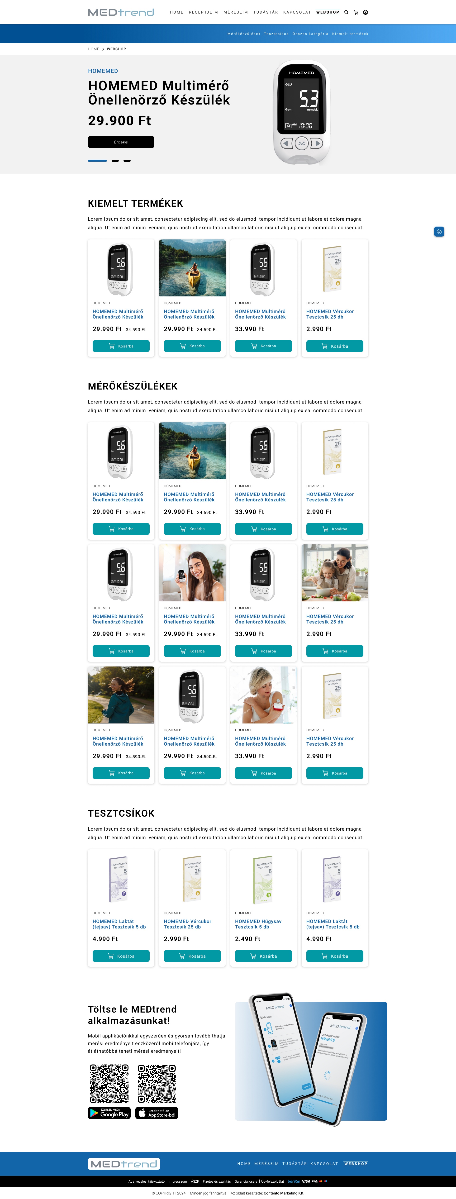
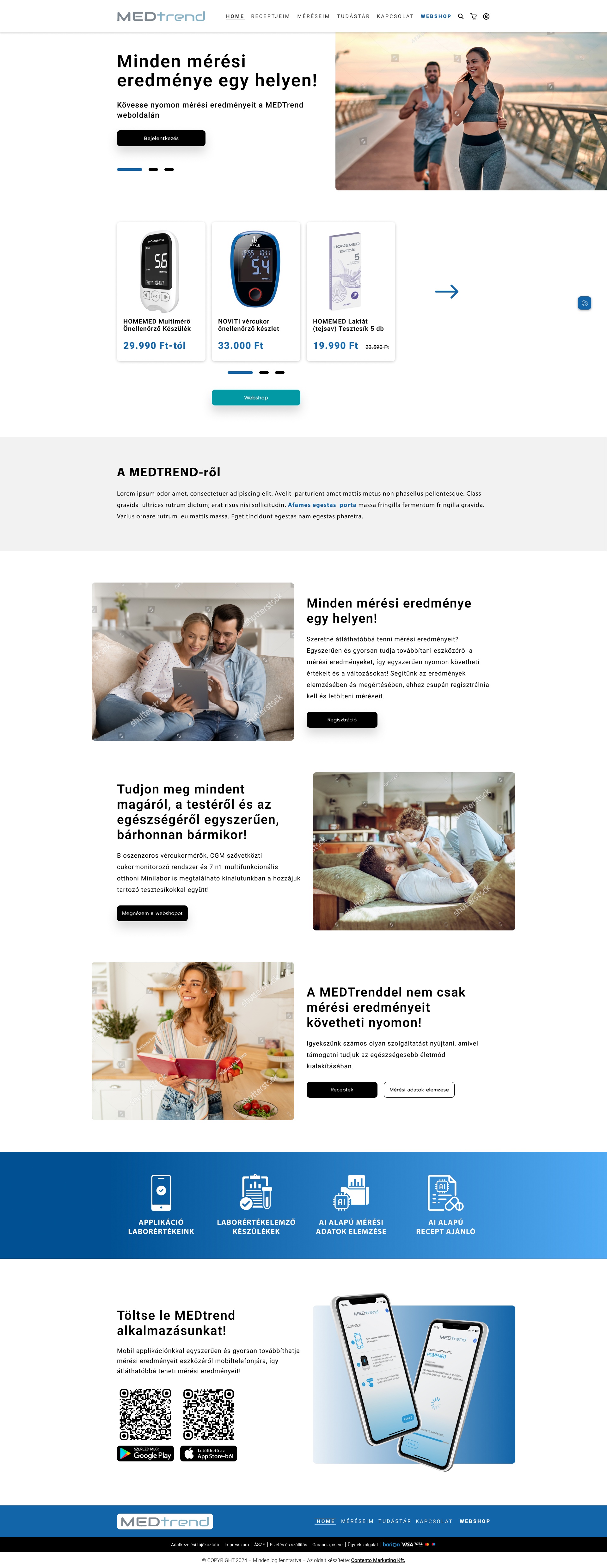
MEDTREND homepage — full page
Scroll inside the frame — full page
00
CONTEXT & ROLE

One Site Doing
Three Jobs

MEDTREND is the digital home of Di-Care Zrt., a Hungarian medical-device company. The same site has to sell blood-glucose meters and a 7-in-1 home minilab, host a private patient portal where people store and read their own measurements, and teach newcomers how to live with diabetes. It had grown into all three at once — and the seams were showing.

Traffic was climbing, but the money spent driving it was leaking away. Paid campaigns dropped people onto a structure that couldn't tell them where to go: the shop, the portal and the articles all competed for the same attention, and users left before they bought, registered or found an answer.

My brief was a full redesign — not a reskin. Rework the information architecture so each audience has an obvious path, give the patient portal the status of a first-class product rather than a buried feature, and deliver a complete, build-ready set of screens the client's developers could implement directly.

MADE FOR
Contento (agency) · client Di-Care Zrt.
CLIENT
Di-Care Zrt. · MEDTREND
PRIMARY GOAL
Patient portal — store & read device measurements
SECONDARY
Webshop · education (Tudástár, recipes, analysis)
PRODUCTS
NOVITI meters · CGM · HOMEMED minilab · test strips
DELIVERED
22 desktop + full mobile, build-ready
BUILD
Custom development from the design
WHAT I OWNED
UX Research & AuditInformation ArchitectureUser Flows Interaction DesignUI & Visual DesignDesign System Responsive / MobileDev Hand-off
01
THE CHALLENGE

Too Many Doors,
No Clear Path

The old site worked — it just made every visitor do the sorting. Three audiences with three different intents met the same undifferentiated page, and the most valuable journey, the patient portal, was the hardest to find.

CONVERSION

Paid traffic leaked out

Campaigns delivered visitors to a layout that didn't route them. People arrived with intent and left without buying, registering or reading — the structure, not the content, was the drop-off.

HIERARCHY

The portal was buried

Storing and understanding your own measurements is the primary reason to return, yet it sat level with everything else. The product's core loop had no prominence.

CLARITY

Shop, portal & learning blurred

A webshop, a logged-in data tool and an education library share nothing but a header. Mixed into one flat menu, each one diluted the others.

DESIGN OBJECTIVE

Give each audience one obvious path — shop, portal or learn — and promote the patient portal to the front of the product, so every forint of ad spend lands somewhere it can convert.

02
INFORMATION ARCHITECTURE

Webshop // Méréseim,
Then Everything Else

The redesign starts at the navigation. The two things people actually come to do — buy a device, or open their measurements — are split out and elevated, with the webshop called out on its own. Behind them, 22 screens resolve into four clean areas.

FOUR AREAS, ONE SYSTEM
Shop
Webshop landing
Product pages
Cart
Checkout & confirmation
Patient Portal
Méréseim (my measurements)
AI data analysis
Login / registration
My data · my orders
Education
Tudástár (knowledge base)
Articles
Recipes
Support & Legal
Contact
Privacy & cookies
Account settings

“The fix wasn't new content. It was telling each visitor, in the first second, which of the three things this is for them.”

03
VISUAL LANGUAGE

Clinical Trust,
Without the Cold

Medical data has to feel trustworthy, but a diabetes companion people open every day shouldn't feel like a hospital form. The system pairs a confident medical blue with a fresher teal, generous white space and large, legible type for a wide age range.

COLOUR
Primary Blue
#0C60A8
Teal
#00909C
Deep Navy
#004890
Sky
#3C90D8
Surface
#F2F7FB

Blue leads, teal confirms

A medical blue anchors structure and links; the brighter teal marks every primary action — login, add-to-cart, register — so the thing to do next is never in doubt.

Legible for every age

Diabetes spans generations. Type is set large, contrast kept high, and controls given real breathing room, so the portal reads as easily at 70 as at 30.

Cards over clutter

Dense medical content is chunked into calm, white cards with clear headers — the same building block used from the shop grid to the data dashboard.

04
THE PRODUCT

One Language,
Every Screen

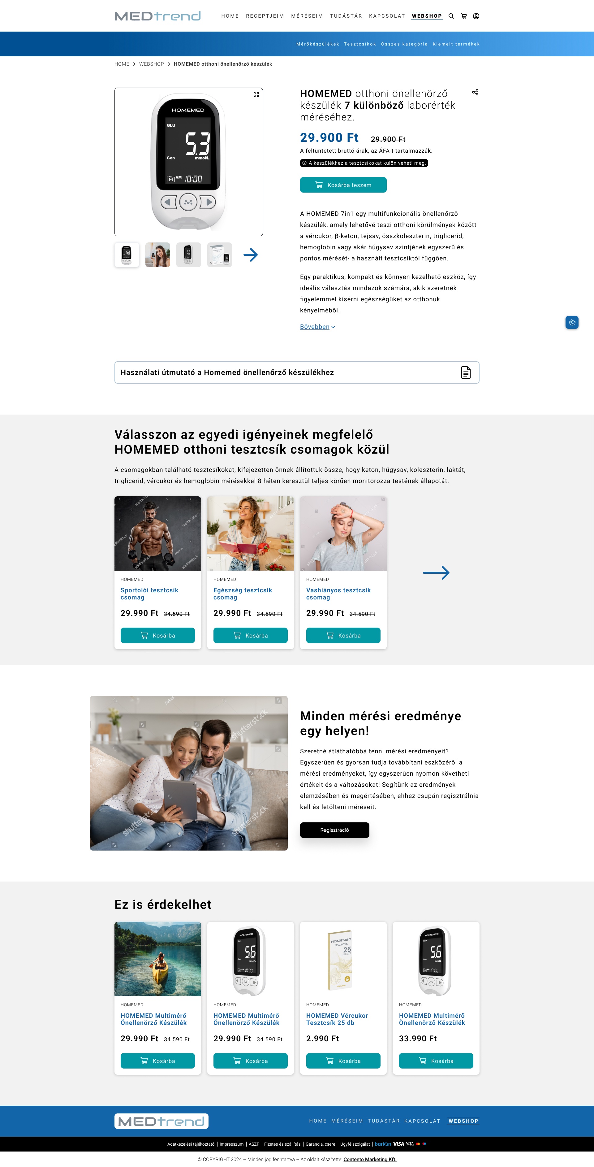
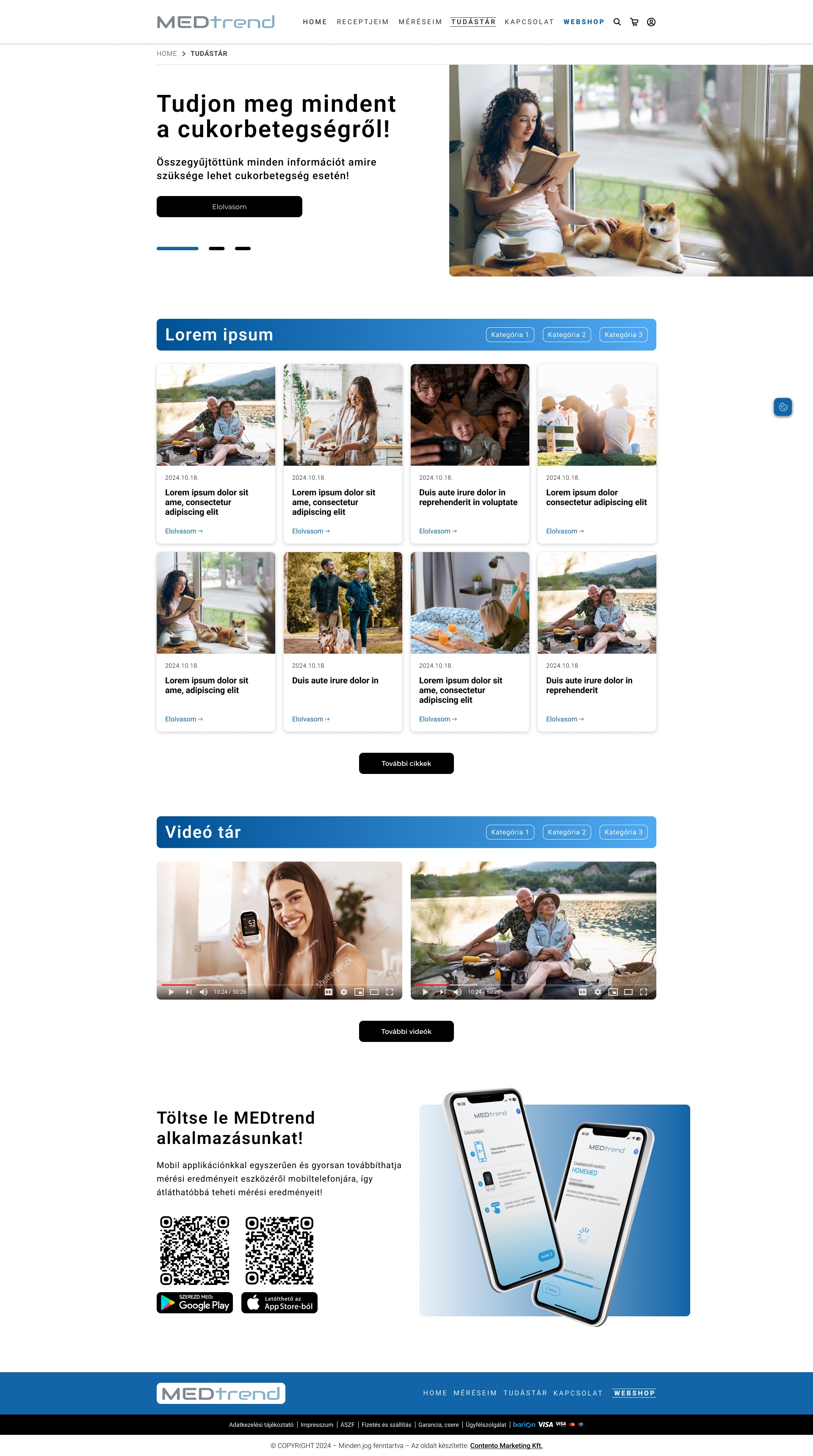
The same system carries the whole platform — from the homepage that now routes three audiences, to the webshop, the product pages and the Tudástár. Each frame below is the complete page; scroll inside it.

05
DEEP DIVE · THE PATIENT PORTAL

Your Measurements,
Finally Readable

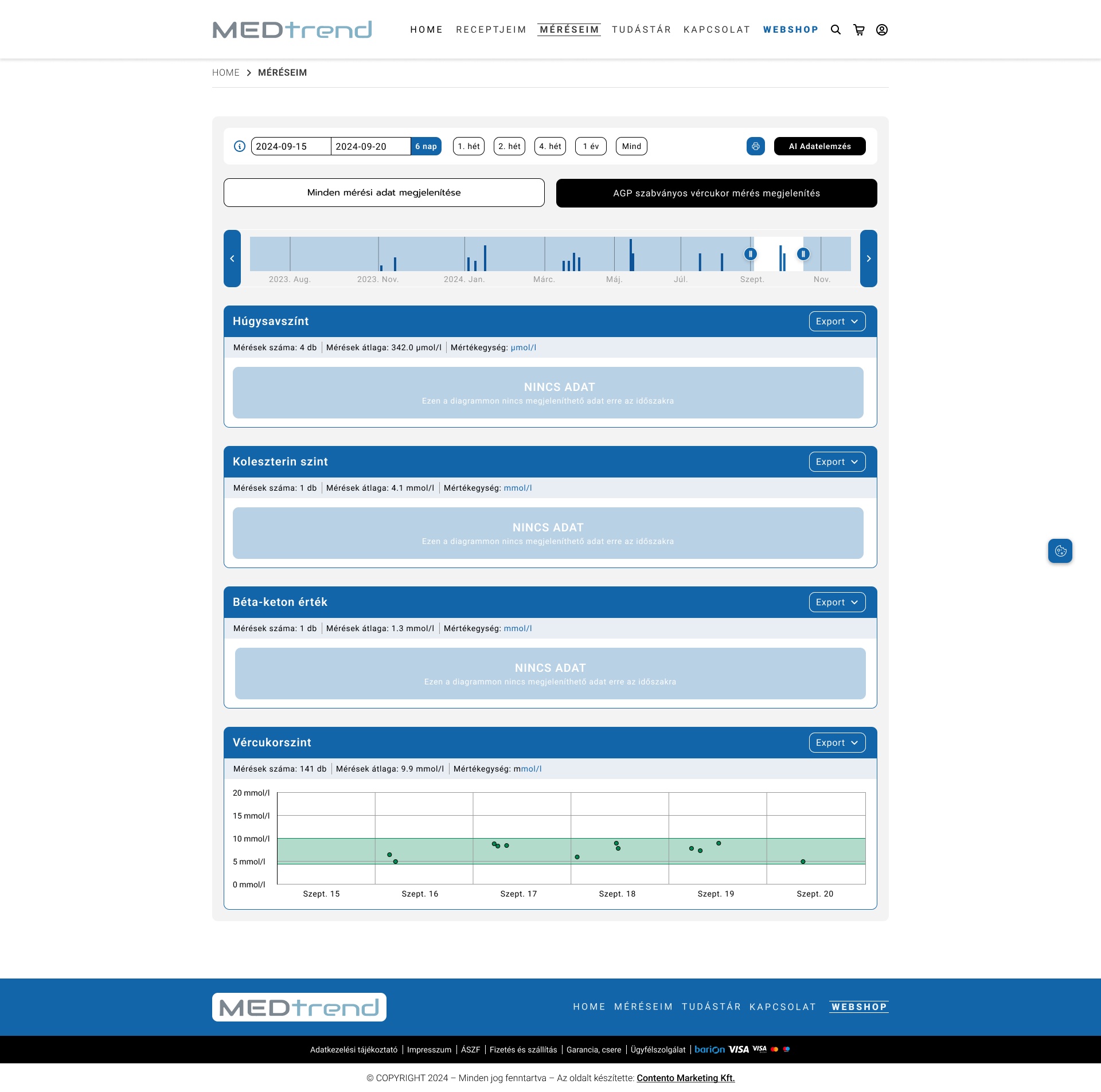
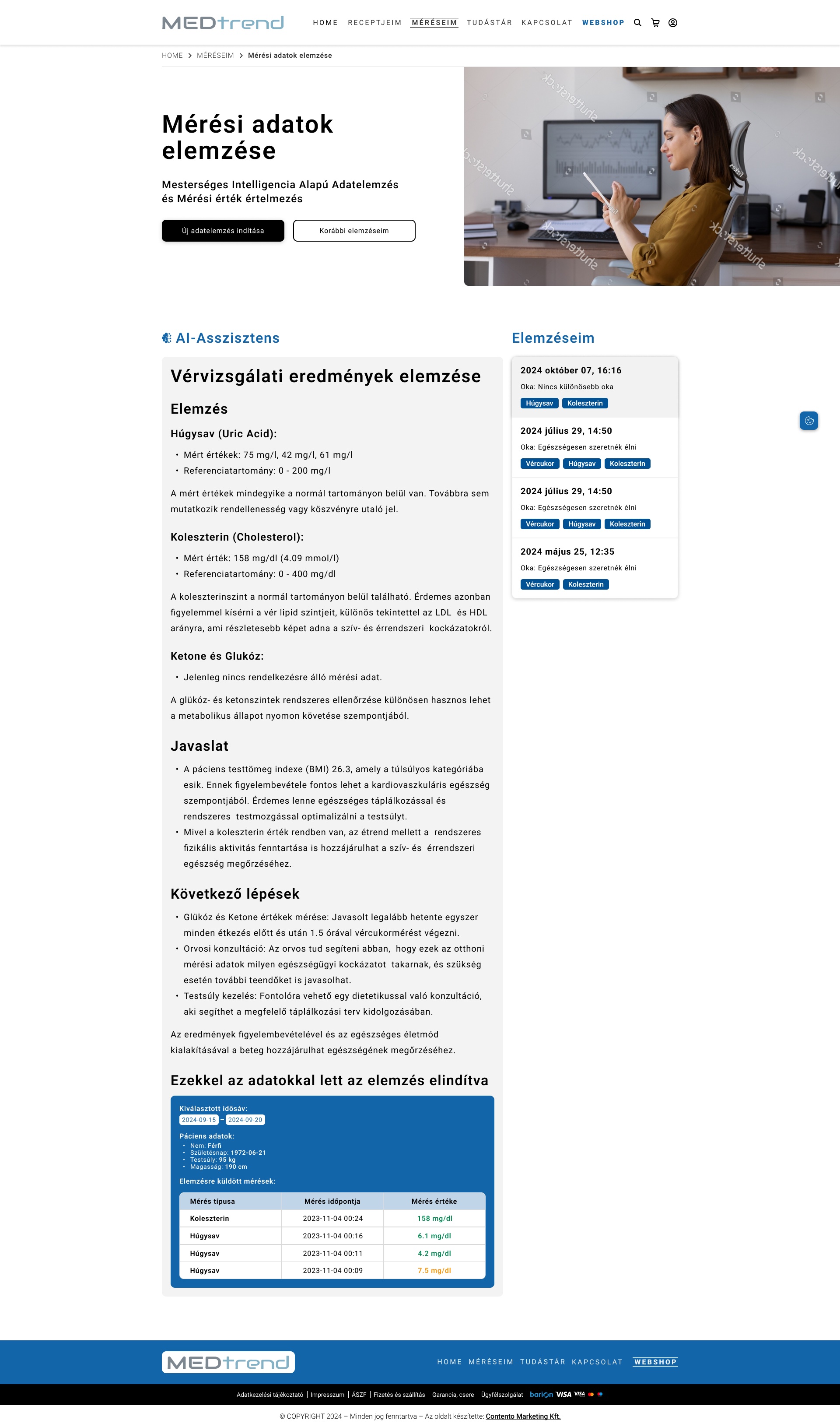
The portal is the reason to come back. A MEDTREND device syncs its readings; the member opens them here, and an AI-assisted analysis turns a wall of numbers — glucose, ketone, cholesterol, haemoglobin and more — into something a person can actually understand.

THE LOGGED-IN LOOP
1

Register behind the gate

Measurements, analysis and recipe generation live behind login — a split, distraction-free sign-in that makes creating an account the path of least resistance.

2

Sync from the device

Readings come off a MEDTREND meter or the HOMEMED minilab via the companion app and land in the portal, no manual entry.

3

Read, don't just store

The analysis view interprets the data over time and surfaces what changed — the step that turns a logbook into guidance.

06
DEEP DIVE · SHOP & CHECKOUT

From Product
to Paid, Calmly

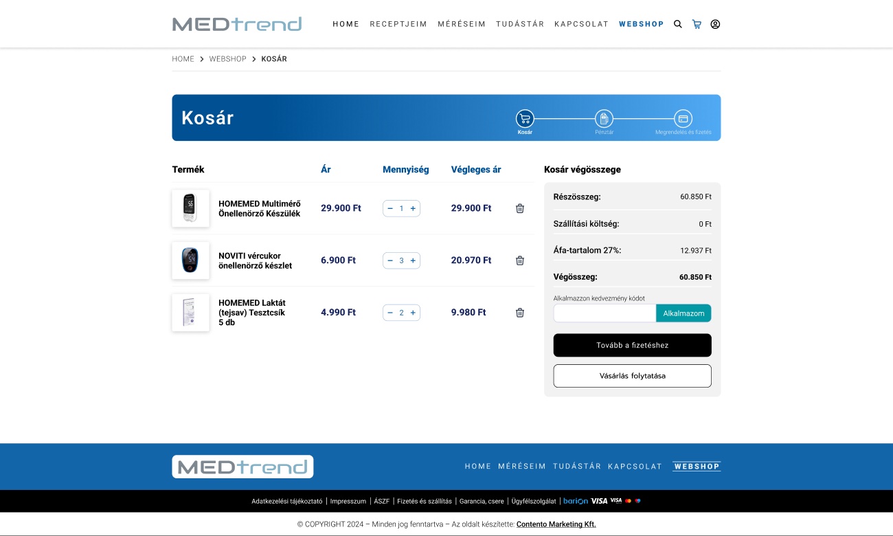
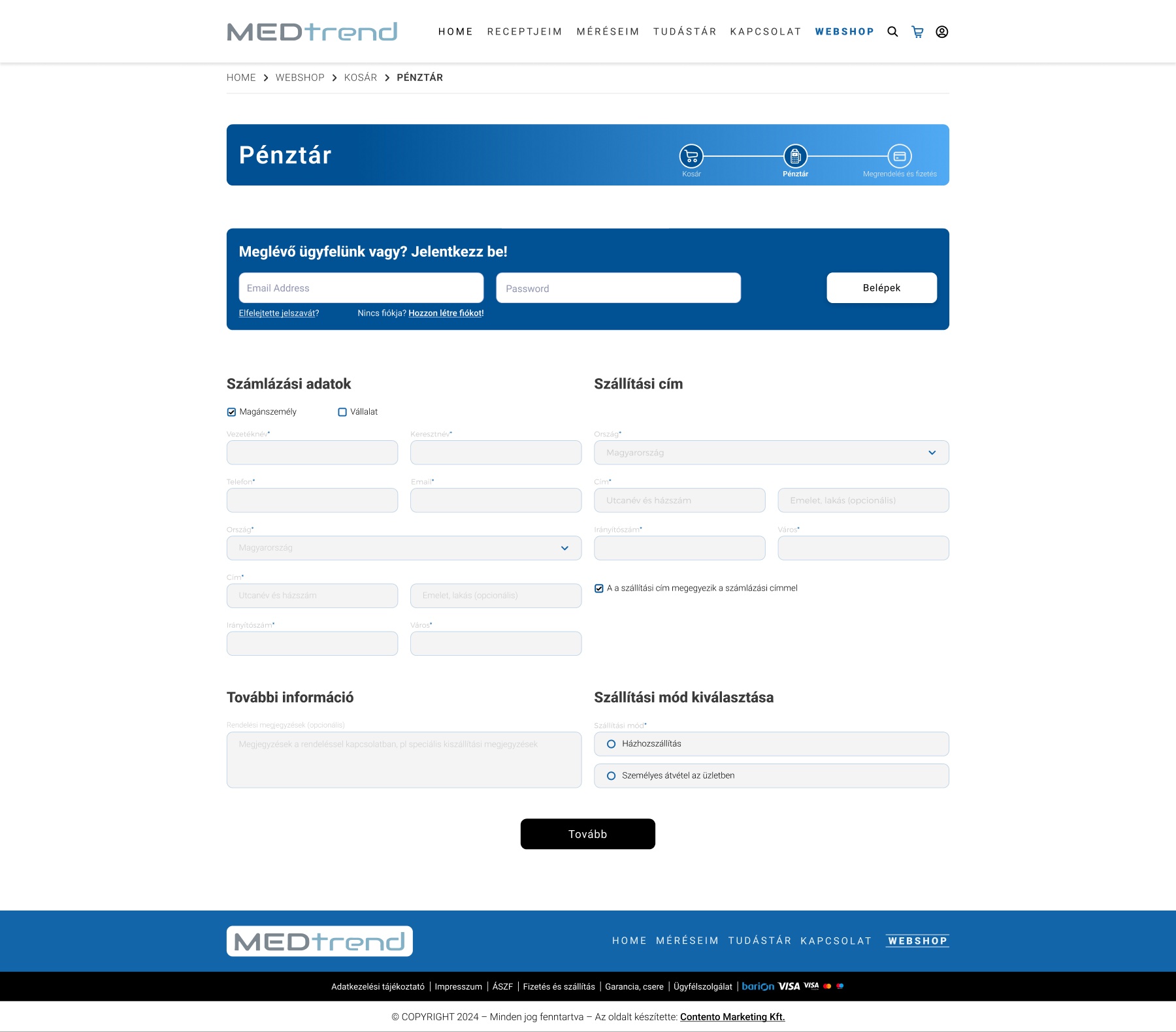
The commercial path is short and unhurried — cart, checkout and confirmation share the portal's calm card language and the same single teal action, so buying a meter feels as reassuring as reading your results.

One action, everywhere

Add-to-cart, continue, pay — always the same teal button in the same place, so the commercial journey never asks the user to re-learn where "next" is.

Shop and portal rhyme

The buyer and the patient are often the same person. Sharing a visual language between the shop and the logged-in portal makes the whole platform feel like one product.

07
RESPONSIVE

Built for the
Phone in Hand

People check a reading on their phone, not at a desk. Every screen has a full mobile layout — the routing homepage, the shop, the product page, the portal and sign-in — redrawn for the thumb, not squeezed. Each device scrolls the complete page.

MEDTREND mobile homepage
HomeRouting, thumb-first
MEDTREND mobile webshop
WebshopOne card per column
MEDTREND mobile product
ProductSpecs stacked to read
MEDTREND mobile data analysis
AnalysisYour trends, in pocket
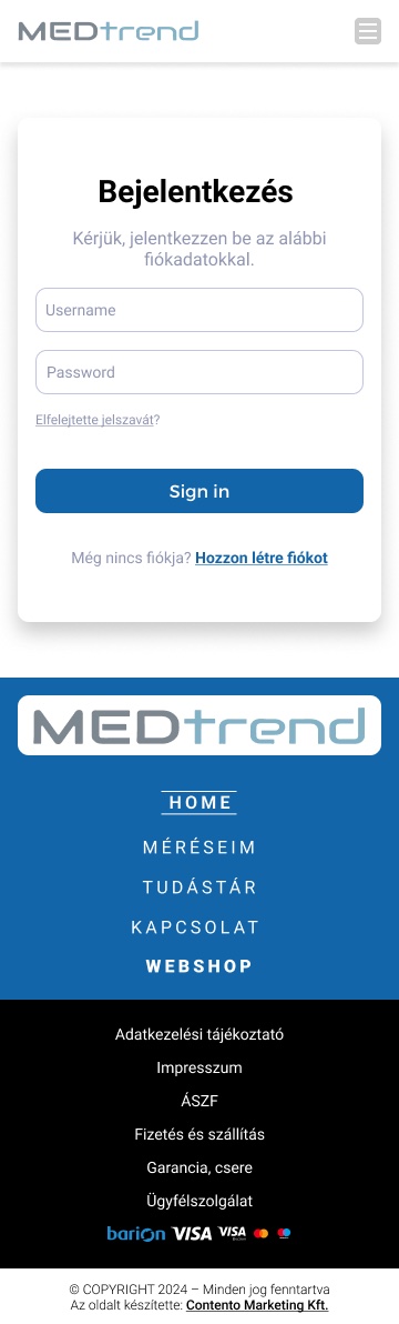
MEDTREND mobile login
LoginThe gate, simplified
08
SCOPE & OUTCOMES

What the
Work Delivered

A complete, build-ready redesign of the whole platform — a clearer structure for three audiences, a patient portal promoted to centre stage, and one coherent system from shop to sign-in.

22
Desktop screens
plus a full mobile set
3→1
Audiences, one system
shop · portal · education
4
Clear areas
from a flat, blurred menu
100%
Build-ready
handed to custom dev

Structure that converts

Rebuilt the IA so paid traffic lands with an obvious next step — buy, register or learn — instead of a page that made every visitor sort it out themselves.

The portal, promoted

Moved the measurement portal and its AI analysis from a buried feature to the product's centre of gravity — the reason to return.

Desktop & mobile, end to end

Delivered every page in both layouts as one system, ready for the client's developers to build without guesswork.