HYBRID MOBILE APP · ANDROID & iOS · BUILT AT _VOIS
Vodafoners App
An all-in-one employee super-app for Vodafone Egypt, designed at _VOIS (Vodafone Intelligent Solutions) — giving the entire workforce instant access to HR, wellbeing, financial benefits and on-site bookings from one role-aware home. Built for around 6,000 staff and is now in daily use.
PLATFORMHybrid · Android & iOS
ROLELead UX Designer
ADOPTION6,000 daily users
ORG_VOIS · Vodafone
00
CONTEXT & ROLE
The Brief, the Team and My Mandate
Vodafone Egypt set out to replace a patchwork of internal HR systems with one mobile product for its entire workforce. Designed at _VOIS, I led the end-to-end product design from discovery to a production-ready, developed app.
Vodafone Egypt employs around 6,000 people across its headquarters, call centres and retail network. Day-to-day, those employees depended on six-plus disconnected systems — an HR portal, a payroll tool, separate booking sheets for parking and transport, scattered PDFs and a wall of email.
The mandate was ambitious: a single, role-aware super-app unifying every employee service behind one login — built as a hybrid app for both Android and iOS, which is why login and the open/close menu behave to each platform's conventions. I owned the design from the first research survey to the final annotated handoff; the app was then developed and shipped, and is now adopted by 6,000 employees.
Vodafone Egypt staff relied on 6+ disconnected systems for everyday HR tasks — no unified app, no consistent experience, and no digital channel for wellbeing.
Fragmented HR Services
Employees juggled 6+ separate systems for HR, payroll, benefits and bookings — each with its own login, interface and workflow, causing daily friction.
Low Digital Adoption
Without a unified touchpoint, staff defaulted to manual processes — phone calls, emails and in-person visits for routine tasks that should take seconds.
No Wellbeing Infrastructure
There was no digital channel for mood tracking, wellness content or pulse surveys — leaving employee wellbeing invisible to the organisation.
DESIGN OBJECTIVE
Design a single, intuitive mobile super-app that consolidates every employee service — from parking and transport booking to payslips and wellbeing — into one seamless, role-aware experience staff actually want to open every day.
02
DISCOVERY & RESEARCH
Listening Before Designing
Before a single screen, I ran a structured discovery to understand how employees actually work, where the friction lives, and what ‘good’ looks like inside a large telecom organisation.
HOW I APPROACHED IT — TWO SURVEYS, ONE LIVE AUDIT
~1,000
Wider survey
A workforce-wide quantitative questionnaire — frequency, satisfaction, design, usability and feature usage.
~100
Focused survey
A smaller qualitative round with open questions: real problems, expectations and "change one thing".
21
Features ranked
Every module was checklisted, so feature usage could be measured and prioritised — not guessed.
1,000+
Hours invested
Research, design and testing end-to-end — from a blank canvas to a production-ready app.
WHICH FEATURES PEOPLE ACTUALLY USE · TOP 12 OF 21
Payslip
159
Emergency Money
101
Installments
92
Offers
89
Phone Program
88
Pension
66
Careers
59
Official Holidays
55
Medical Cards
50
Transportation
48
Newsletter
38
Ask HR
36
Payslip towers over everything — and the whole top of the chart is money: Payslip, Emergency Money, Installments, Phone Program, Pension. This single chart decided what earns a place on the home screen.
Design rate (today)
Outdated — peaks at "average / good", below the bar Vodafone aims for.
Poor
13
Average
39
Good
60
Very good
40
Excellent
32
Usability rate (today)
Doable, but stuck in the "average" middle — the goal was to push it positive.
Poor
17
Average
41
Good
53
Very good
38
Excellent
23
WHAT THE RESEARCH TOLD US
INSIGHT 01
“I waste half an hour just finding the right system to ask for a day off.”
DESIGN IMPLICATION
Employees couldn't locate services — discovery, not features, was the core problem. This drove a single, searchable home with role-based shortcuts.
INSIGHT 02
“I never know what my benefits actually are.”
DESIGN IMPLICATION
Benefits and entitlements were invisible. We surfaced them contextually on the dashboard and made them tappable, not buried in PDFs.
INSIGHT 03
“By the time I get to a desktop, I've forgotten what I needed.”
DESIGN IMPLICATION
Tasks happened on the move, on phones. Mobile-first, two-tap task completion became a non-negotiable design constraint.
INSIGHT 04
“Nobody asks how we're actually doing.”
DESIGN IMPLICATION
There was no wellbeing channel. This surfaced the opportunity for the daily Mood Tracker and anonymous pulse surveys.
03
WHO WE DESIGNED FOR
Three Employees, One Shared Frustration
Discovery clustered the workforce into three archetypes. Every design decision was pressure-tested against their goals, contexts and constraints.
MH
Mona Hassan
Call Centre Agent · HQ · Shift worker
GOALS
Request leave and check shifts in seconds
Book the company bus home each evening
See her payslip without a desktop
FRUSTRATIONS
No company laptop — phone is her only tool
Paper forms for routine HR tasks
No idea who to ask for what
MOST-USED MODULES
V-BusPayslipMood Tracker
AK
Ahmed Kamal
Field Engineer · Mobile · On the road
GOALS
Reserve a parking spot before arriving
Log HR and expense requests on site
Stay current on company news
FRUSTRATIONS
Six logins for six different tasks
Loses time hunting for the right portal
Benefits feel hidden and unclear
MOST-USED MODULES
Smart ParkingHR RequestsInstallments
SF
Sara Fouad
HR Business Partner · HQ · Office
GOALS
Push pulse surveys to her teams
Read an honest wellbeing signal
Resolve employee requests faster
FRUSTRATIONS
No continuous data on team morale
Wellbeing is invisible until it's a crisis
Tools don't talk to each other
MOST-USED MODULES
SurveysMood DashboardOrg Chart
04
INFORMATION ARCHITECTURE
One Home, Fourteen Doors
A flat, searchable architecture replaced six siloed systems. A persistent global bar keeps the essentials one tap away, while every service lives in one of four clear clusters on the home screen.
PERSISTENT GLOBAL NAVIGATION
Home
Role-aware dashboard
Search
Find any service fast
TOBi
AI assistant & FAQs
Menu
Full service directory
Alerts
Notifications & surveys
MODULE MAP · 14+ SERVICES IN 4 CLUSTERS
HR & Pay
Payslip
HR Requests
Pension
Org Chart
Employee Handbook
Workplace
Smart Parking
Transport (V-Bus)
On-site Vendors
Gym & Classes
Nursery
Money & Benefits
Device Installments
Mobile (RED) Plan
Phone Program
Medical Network
Wellbeing & Culture
Mood Tracker
Pulse Surveys
Company News
Photos & Videos
Vacancies
05
USER FLOW
One Path In, Every Task From Home
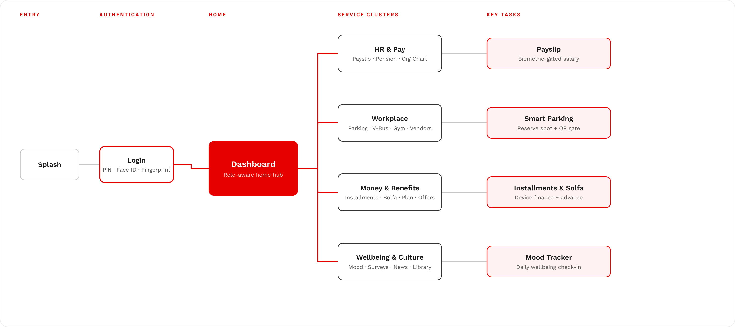
A single entry funnel — splash, then biometric or PIN login — lands every employee on a role-aware dashboard. From that one hub, four service clusters fan out to 30+ tasks, each two taps deep.
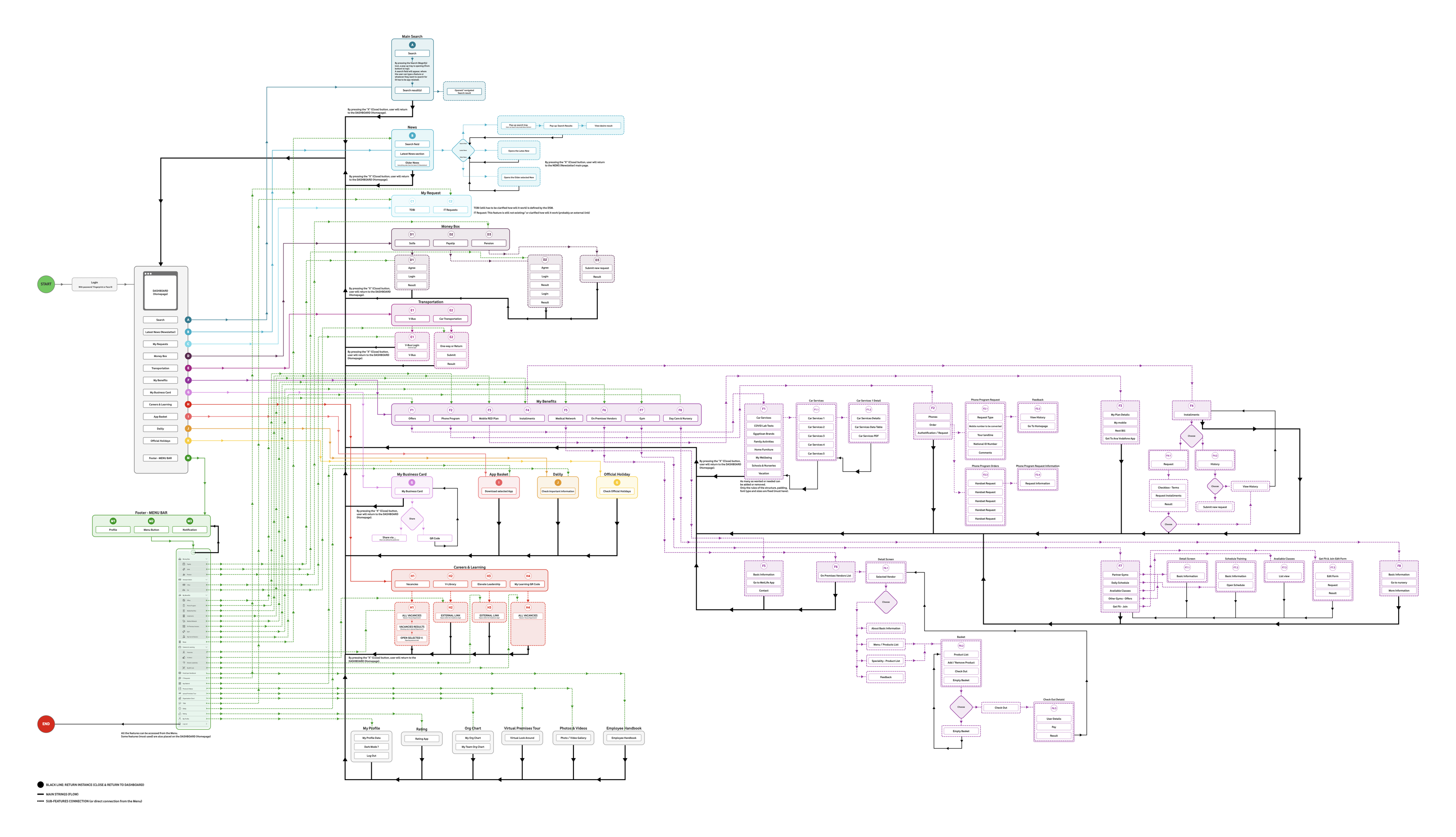
THE COMPLETE USER FLOW · FROM THE ORIGINAL DESIGN
Every screen, branch and decision across the full app — from splash and login through all 30+ modules, with role-based and conditional paths. Zoom into the artboard to read the detail.
SIMPLIFIED — THE SAME JOURNEY IN PLAIN TERMS
Primary path & branching
Drill-down to a task
06
DESIGN PRINCIPLES
Five Rules That Settled Every Argument
When trade-offs got hard, these five principles — drawn straight from the research — decided the call. They kept eight thousand users, not internal politics, at the centre.
01
Make it easy to find
Discovery, not features, was the real problem. A searchable home and role-based shortcuts put every service where people instinctively look.
02
Two taps to done
Leave, parking, payslip — each routine task is reachable in two taps, optimised for the busiest, most distracted moment of someone's day.
03
Show me what's mine
Content, benefits and shortcuts adapt to role, office and entitlements, so the app feels personal from the very first launch.
04
Wellbeing is a feature
A daily check-in and pulse surveys make employee wellbeing a visible, designed-for part of the product — never an afterthought.
05
One system, everywhere
A shared design system ships an identical experience across Android, iOS, English and Arabic, at full organisation scale.
07
THE SOLUTION
One App. Every Employee Service.
A single role-aware home consolidates 14+ feature modules behind one login — turning a fragmented toolset into one daily habit.
“From six logins to one — an everyday app that feels less like enterprise software and more like home.”
01
Unified Service Hub
One home screen surfaces 14+ modules — HR, payroll, benefits, parking, transport and gym — each just two taps away.
02
Role-Aware Personalisation
Shortcuts, benefits and content adapt automatically to each employee's role, office location and entitlements.
03
Built-In Wellbeing
A daily mood tracker, wellness hints and pulse surveys make employee wellbeing a first-class, measurable feature.
SCOPE THAT GREW WITH TRUST
+5 features, mid-flight
The client was happy enough during the project to ask for five extra modules — including the Mood Tracker and Smart Parking — folded into the same system without slowing delivery.
A full dark theme
They also requested a complete dark version as an extra. Because the system was token-driven, every component was already dark-mode-aware — so it shipped cleanly.
One hybrid app, two platforms
Delivered as a hybrid Android & iOS product — which is exactly why login and the open/close menu follow each platform's own conventions.
08
DESIGN SYSTEM
A System, Not a Pile of Screens
In an enterprise product, consistency isn't an aesthetic preference — it's how you keep a 6,000-person workforce oriented. Every screen is assembled from a single source of truth: semantic design tokens sitting on an 8-point grid, feeding one component library. That architecture is what holds 100+ screens legible and identical across two platforms and both themes — and what let the system absorb five extra modules and a full dark theme, mid-project, without a single decision being re-litigated.
COLOUR TOKENS
Vodafone Red
#E60000
Near-Black
#0D0D0D
Ink
#1A1A1A
Slate
#5A5A5A
Surface
#F6F6F6
White
#FFFFFF
Colour is never hard-coded. Semantic tokens — surface, text, border, state — bind once and resolve per theme, which is precisely why the dark version shipped as an extra without re-drawing a single screen.
TYPE SCALE · WORK SANS
Vodafoners
Display
34 · ExtraBold
Vodafoners
Title
22 · SemiBold
Vodafoners
Headline
17 · SemiBold
Vodafoners
Body
15 · Regular
Vodafoners
Caption
13 · Medium
WHY IT'S BUILT THIS WAY — THREE DECISIONS THAT SCALE
A semantic token layer
Components reference intent — surface, accent, on-accent — never a hex. Re-theming becomes a data change, not a redesign, so light, dark and both platforms stay in lock-step from one definition.
An 8-point spatial grid
Every margin, pad and gap is a multiple of eight. That single constraint removes hundreds of arbitrary spacing decisions and gives the whole product a rhythm the eye reads as calm, deliberate order.
A modular type scale
Five steps — Display to Caption — cover every screen. A fixed hierarchy means importance is expressed by role, not by nudging font sizes, so scanning a dense HR screen stays effortless.
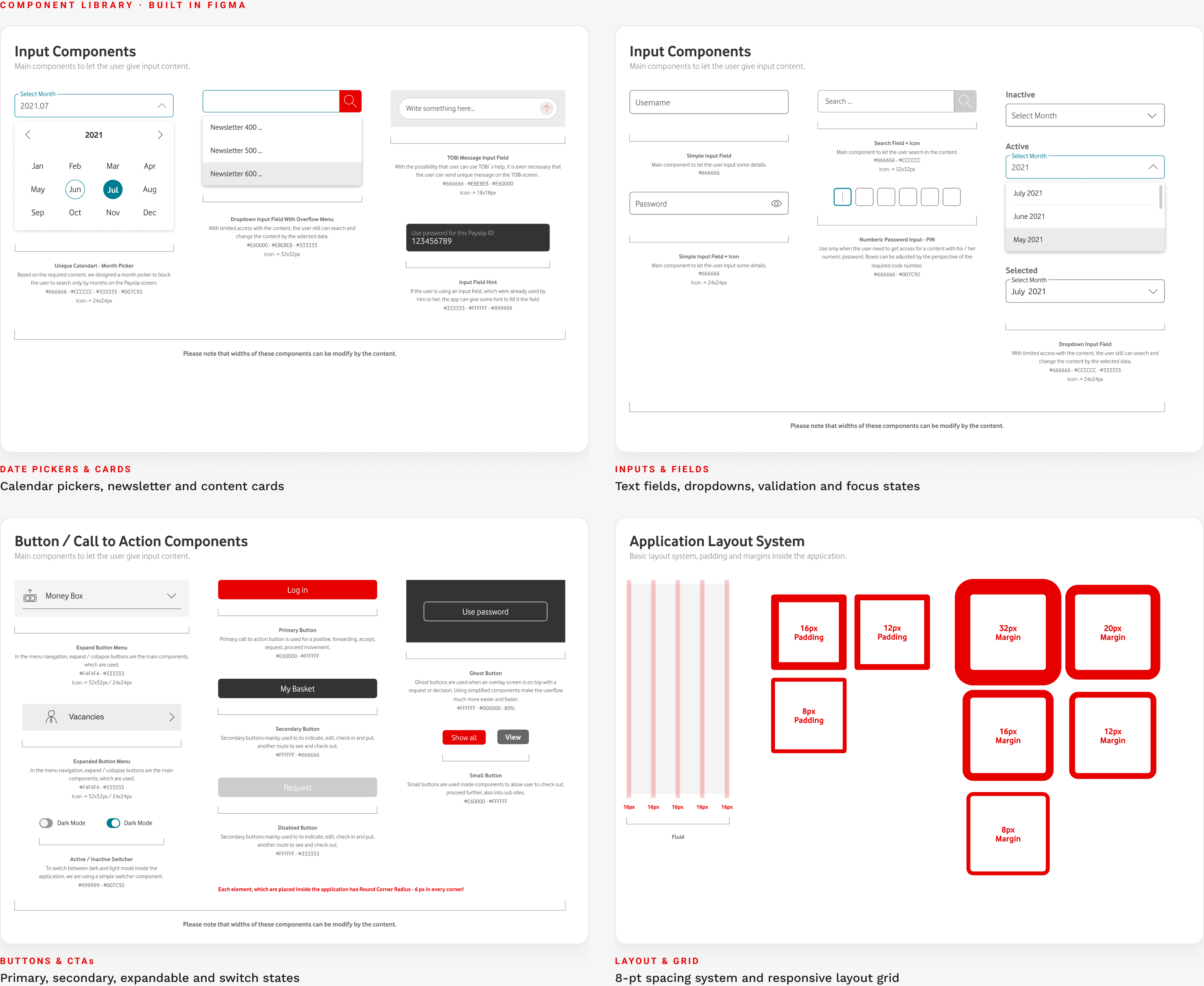
THE COMPONENT LIBRARY · ONE KIT, EVERY SCREEN
09
DESIGN PROGRESSION: FROM ARCHITECTURE TO INTERFACE
Earn the Pixels Before You Place Them
Fidelity is a sequence, not a style. I don't reach for colour, type or elevation until the structure underneath is proven — because polishing an unsolved layout only makes the wrong thing look convincing. The home screen shows that discipline end to end: the same dashboard, moved deliberately from a grey-box skeleton that settled the information architecture to a design-system interface engineered to be read at a glance.
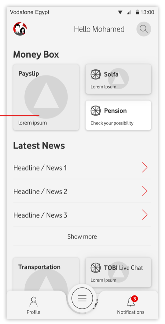
ONE SCREEN, TWO STAGES · THE ROLE-AWARE HOME
STAGE 01 · LOW FIDELITY
Solve the structure first
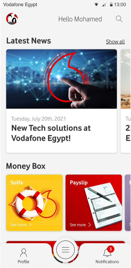
Greyscale on purpose. The only questions that mattered here were architectural: does Money Box earn its place above the fold, is the news feed signal or noise, and can any core task be reached in two taps? Kept deliberately plain, so no review is spent debating a corner radius while the flow itself is still in question.
Information ArchitectureFlow efficiencyThe two-tap rule
→
STAGE 02 · HIGH FIDELITY
Then layer the interface
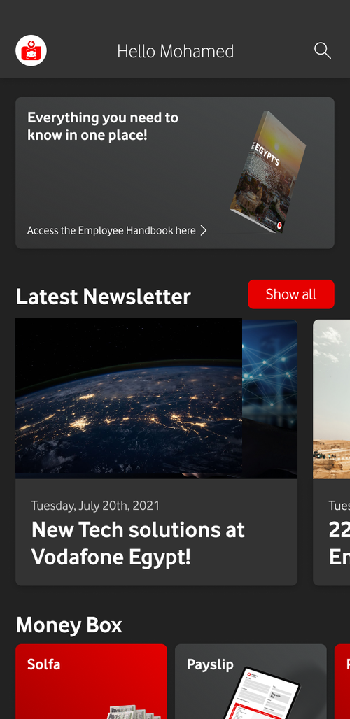
Only once the skeleton held did I commit to high fidelity — and every visual decision had a job. The design system supplied colour, type and spacing, so nothing was reinvented per screen; hierarchy pushed Money Box forward and quietened the rest; and contrast, target size and labelling were held to WCAG AA. Same architecture, now legible in a single glance.
Design systemVisual hierarchyWCAG AA
THE STRATEGY BEHIND THE SEQUENCE
LO-FI · PROVE THE STRUCTURE
Function before form
Wireframes were where the genuinely hard problems got solved — module priority, navigation depth, and whether the two-tap rule survived contact with 33 services. Working in greyscale kept every stakeholder review on architecture and flow rather than aesthetics, so structural mistakes surfaced while they were still cheap to fix.
HI-FI · REDUCE THE LOAD
Fidelity with intent
The move to high fidelity was a decision to reduce cognitive load, not to decorate. The design system set the vocabulary, visual hierarchy directed attention to what employees open most, and AA contrast plus 44pt targets were enforced from the first pixel — so accessibility was designed in, never retrofitted at the end.
“I commit to pixels only once the structure is proven — colour on an unsolved problem just makes the wrong thing look finished.”
10
APP SCREENS
A Super-App for Every Need
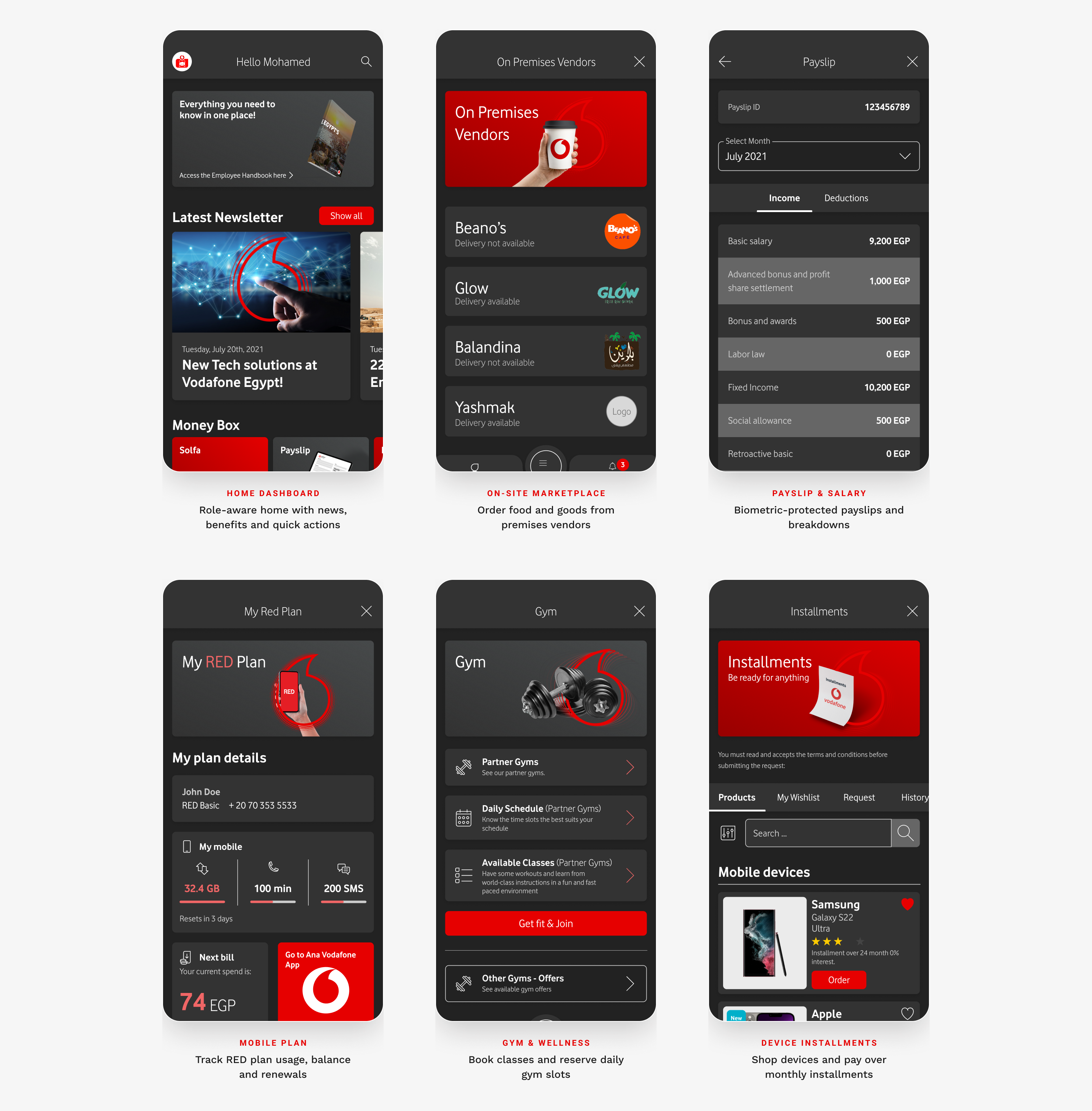
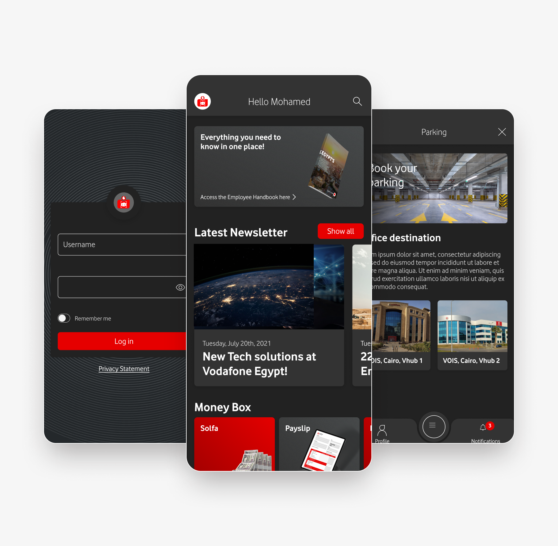
Fourteen-plus modules unified under one navigation — everything from payslips and mobile plans to on-site food ordering, gym booking and company news.
11
DARK THEME · A CLIENT-REQUESTED EXTRA
The Whole App, After Dark
The client was happy enough with the product to ask for a complete dark theme on top of the original scope. Every screen was re-mapped to a dark palette — not a blind inversion — keeping Vodafone red as the accent while preserving contrast and legibility across all 33 services.
DARK MODE · KEY SCREENS
HOMEThe role-aware dashboard, after dark.
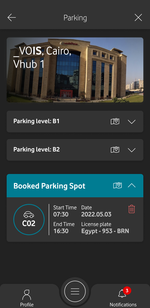
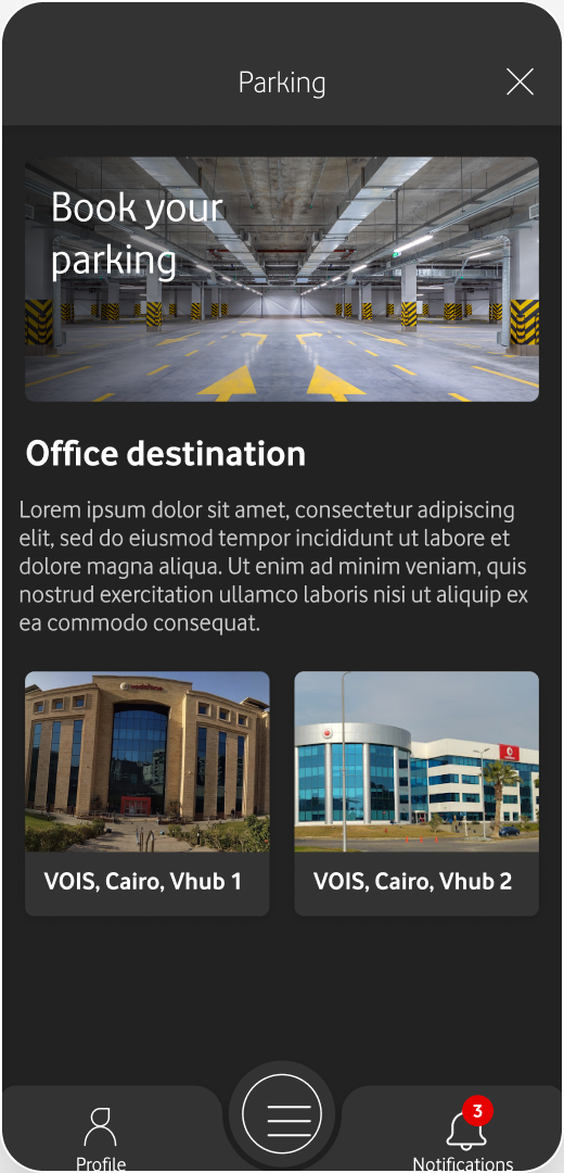
PARKINGThe same booking flow in the dark palette.
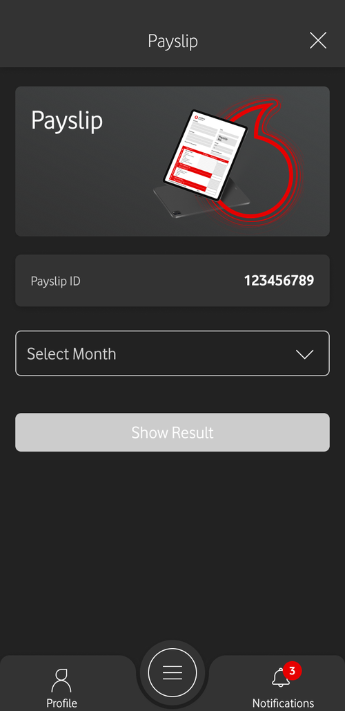
PAYSLIPThe single most-used screen, re-themed.
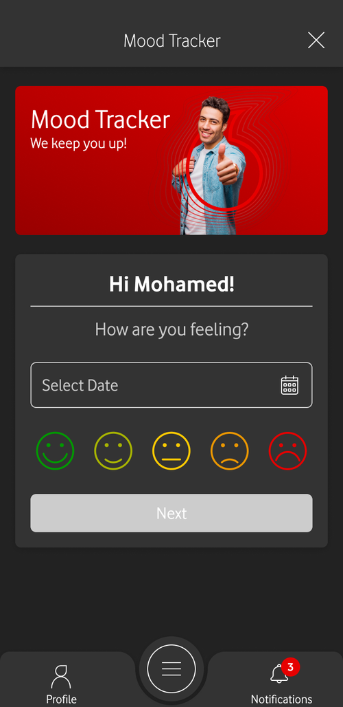
WELLBEINGMood Tracker — one of the five extra features.
12
SERVICE DIRECTORY · THE FULL MENU
Thirty-Three Services, One Tidy Menu
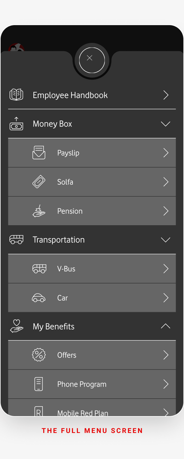
Behind the dashboard sits the complete directory: every internal service Vodafone Egypt offers, organised into six scannable groups and reachable from a single searchable menu.
33
Services
6
Groups
≤ 2
Taps to any of them
1
Searchable menu
MONEY BOX3
Payslip · Solfa · Pension
MY BENEFITS8
Offers · Phone Program · Mobile RED Plan · Instalments · Medical Network · On-Premises Vendors · Gym · Day Care & Nursery
WORKPLACE6
Parking · V-Bus · Car · Virtual Premises Tour · Organization Chart · Employee Handbook
TOBi (AI) · IT Requests · Dalily · Speed Test · My QR Code · App Basket
13
DEEP DIVE · SMART PARKING
Reserve a Spot Before You Arrive
HQ parking was first-come, first-served chaos — staff circling the garage, no idea where space was free. The Smart Parking flow turns that into a calm, three-decision booking with gate access in the app.
THE PROBLEM
No visibility of free spaces meant wasted time and stress every morning, plus disputes over reserved bays and accessibility spots.
THE APPROACH
Break booking into building → level → spot, show live availability on a map, and replace the security desk with an in-app QR for the gate.
THE BOOKING FLOW · FOUR REAL SCREENS
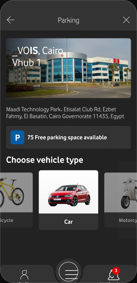
01 · ENTRYBook your spot and pick the office destination.
02 · TYPEChoose the parking type that fits.
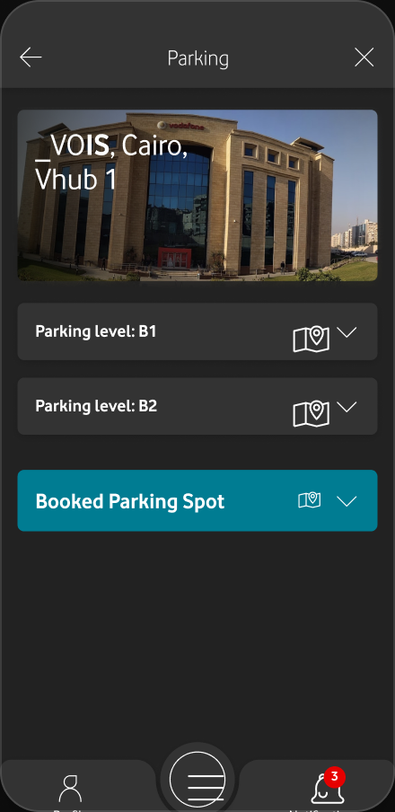
03 · LEVELLive availability, floor by floor.
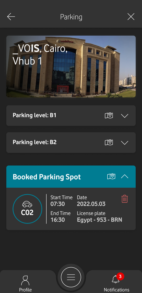
04 · BOOKEDConfirmation with spot, time and plate — your phone is the gate pass.
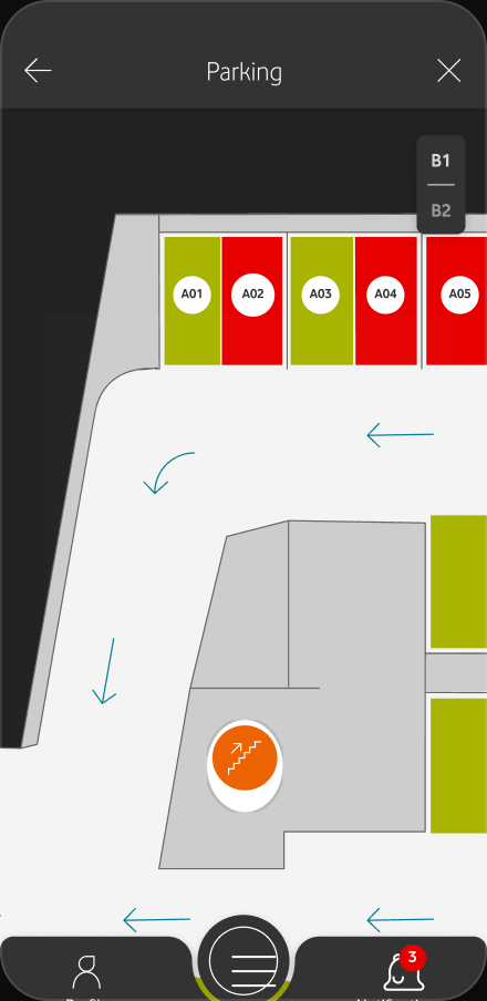
05 · SPOTPick an exact free bay on the map.
KEY DESIGN DECISIONS
Progressive disclosure
Building → level → spot keeps each screen to a single decision, so booking never feels like filling in a form.
Live availability everywhere
Free-space counts on every step kill the guesswork that used to send people circling the garage.
The phone is the gate pass
A booked spot generates a QR for barrier access — removing the security-desk bottleneck entirely.
14
DEEP DIVE · FINANCIAL BENEFITS
Buy Now, Pay From Payroll
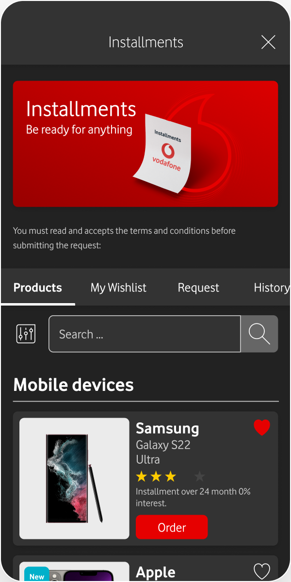
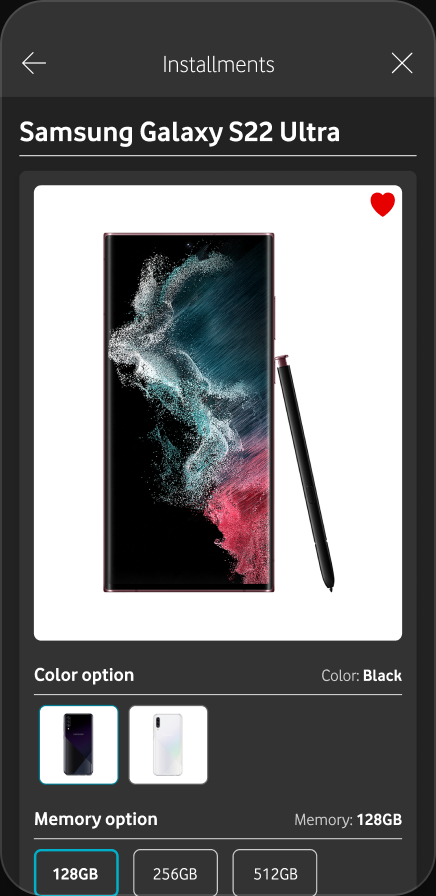
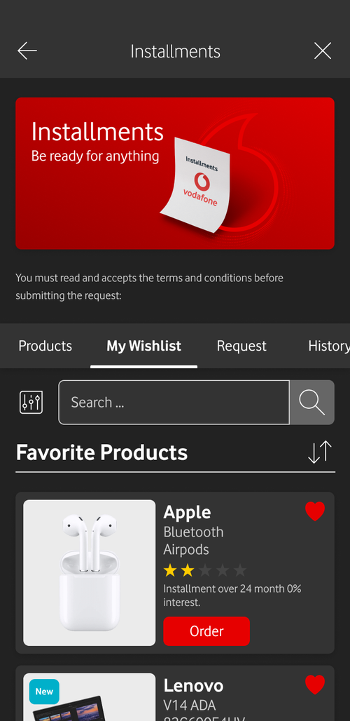
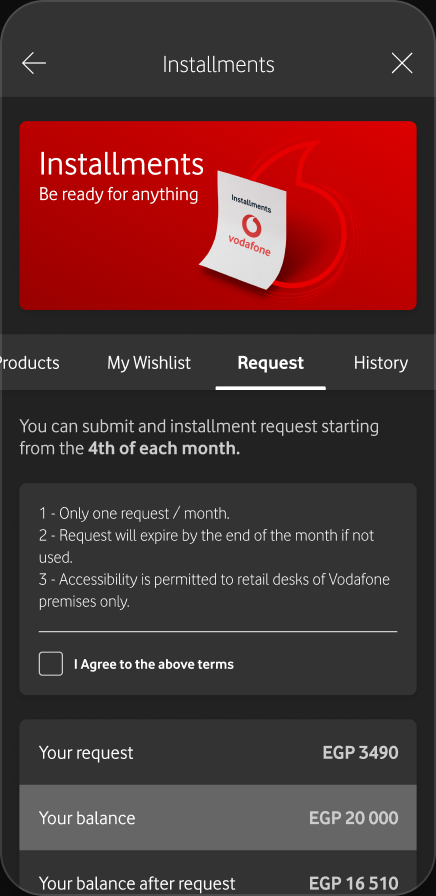
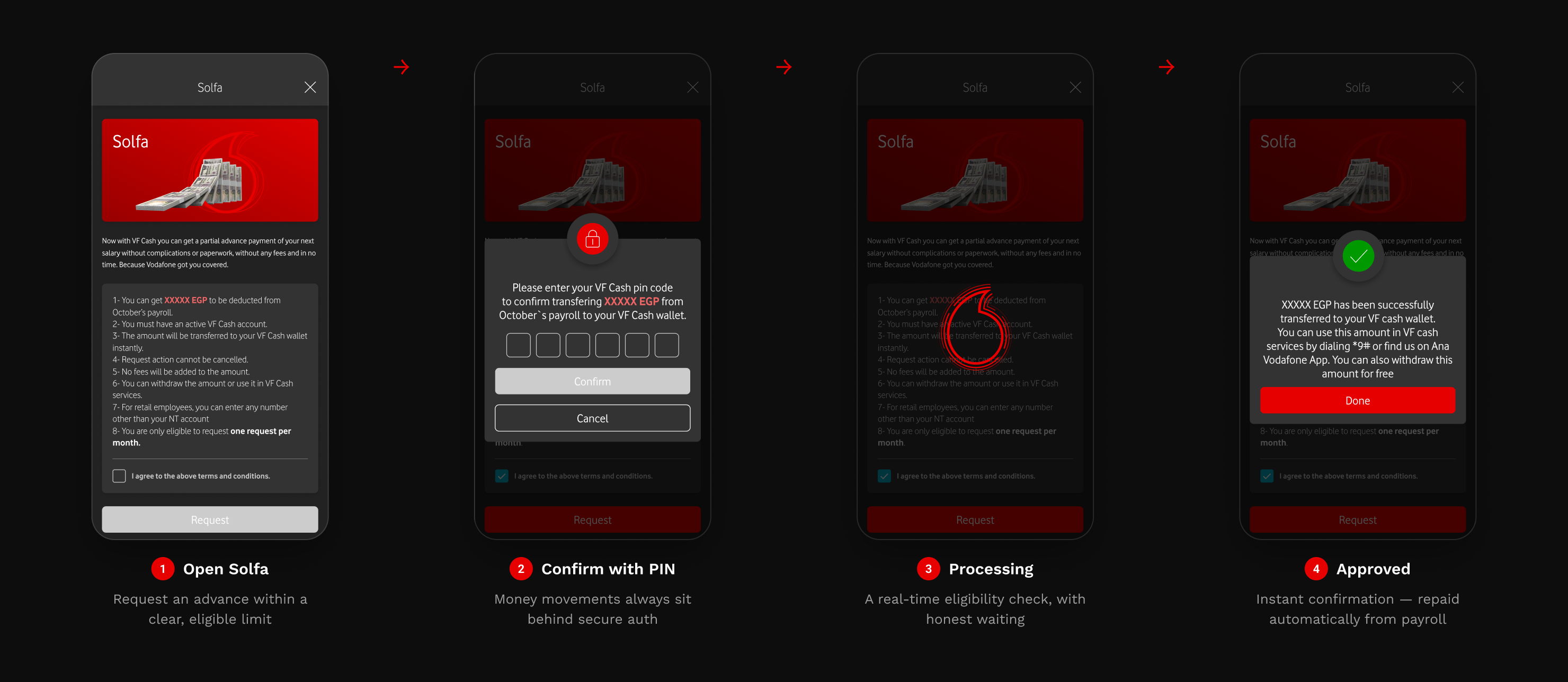
Two of the most-used benefits are financial: an Installments store for devices paid off through payroll, and Solfa — a secure salary advance for short-term needs, without an external lender in sight.
THE NEED
Staff wanted access to phones, laptops and short-term cash — but informal lending and external financing were costly, slow and easy to mistrust.
THE APPROACH
Bring both in-house: an installment store deducted automatically from salary, and Solfa advances approved in-app with biometric/PIN security and clear terms.
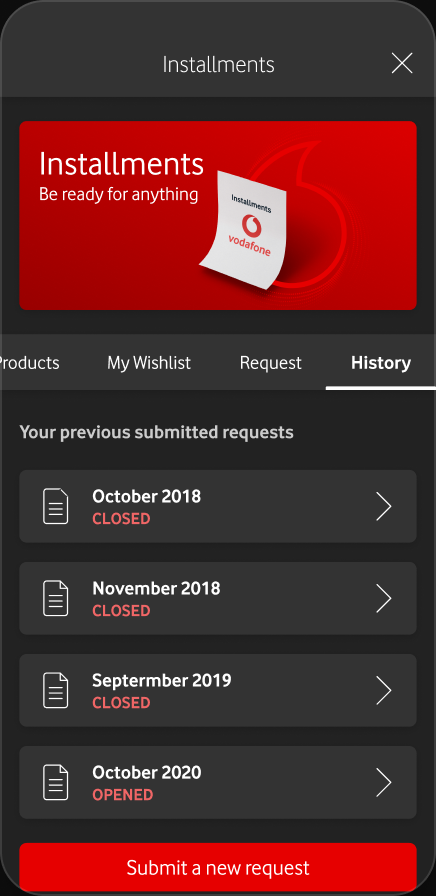
FLOW A · INSTALLMENTS — THE DEVICE STORE
01 · BROWSEA filterable catalogue of phones, laptops and tech.
02 · DETAILSpecs, colour, memory, monthly plan and eligibility.
03 · WISHLISTHeart products to a wishlist before submitting a request.
04 · REQUESTPick a tenor; see the exact monthly deduction.
05 · HISTORYTrack every installment plan and its status.
FLOW B · SOLFA — SALARY ADVANCE
KEY DESIGN DECISIONS
Repaid from payroll, automatically
No manual transfers and no missed payments — deductions are scheduled, visible and predictable from day one.
Security proportional to the stakes
Every money movement sits behind biometric or PIN, with the amount and terms always shown before confirmation.
Honest limits, shown up front
Eligibility and caps appear before a request — nobody gets their hopes up only to be rejected at the end.
15
DEEP DIVE · ON-SITE COMMERCE
Order Lunch Without Leaving Your Desk
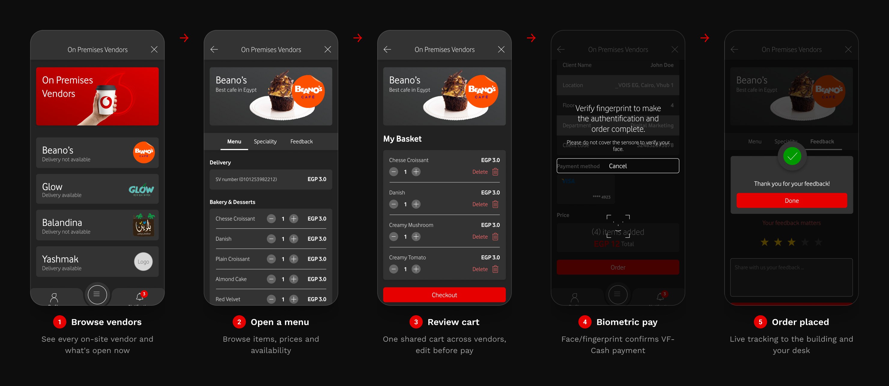
On large campuses, ordering food or supplies meant queues, cash and chasing vendors. The On-Premises Vendors module turns the whole site into an in-app marketplace — browse, pay biometrically and track delivery to your desk.
THE PROBLEM
Queues at peak hours, cash-only stalls and no way to know if an order was ready — staff lost real time to lunch logistics.
THE APPROACH
A unified marketplace of on-site vendors with a shared cart, biometric VF-Cash payment and live order tracking to the building and desk.
FROM CRAVING TO DELIVERED
KEY DESIGN DECISIONS
One cart, many vendors
Order from several stalls in a single basket and pay once — no juggling separate orders or queues.
Pay with a glance
VF-Cash plus biometric confirmation removes cash and card friction at the busiest moment of the day.
Track it to the desk
Live status from kitchen to hand-off means nobody waits in line just to check whether an order is ready.
16
DEEP DIVE · PAYSLIP & SECURITY
Sensitive Data, Calmly Secured
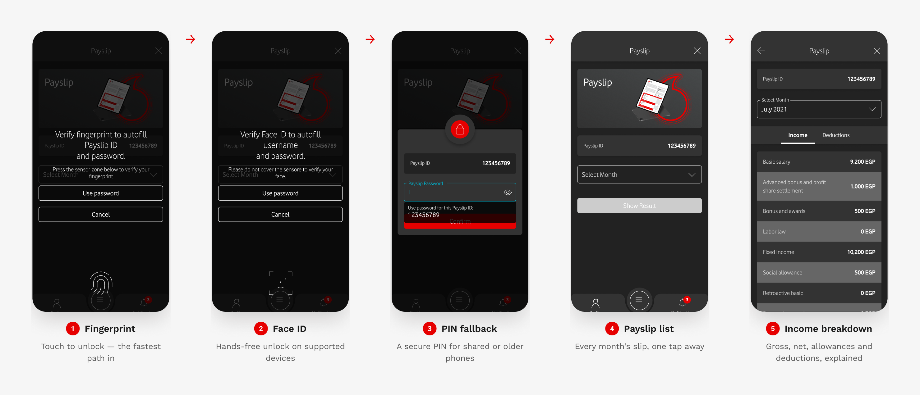
A payslip is the most sensitive thing in the app. The challenge: protect it rigorously without making people feel locked out of their own salary. The answer is biometric-first access with a graceful fallback.
THE TENSION
Strong security usually means friction. Employees check pay on the move and won't tolerate a clunky login every time — but the data demands protection.
THE APPROACH
Default to fingerprint or Face ID for an instant, secure unlock, with a PIN fallback for shared and older devices. Re-authenticate on every entry.
AUTHENTICATE, THEN VIEW
KEY DESIGN DECISIONS
Biometric-first, PIN always
The vast majority unlock instantly with a touch or glance — and nobody is ever locked out of their own pay.
Re-authenticate on every open
Payslips are never left behind a stale session; each visit re-verifies identity, so a borrowed phone exposes nothing.
Numbers people can read
A plain-language breakdown of gross, net, allowances and deductions builds trust in the figures, not just access to them.
17
FEATURED FLOW · WELLBEING
Wellbeing, Built Into the Everyday
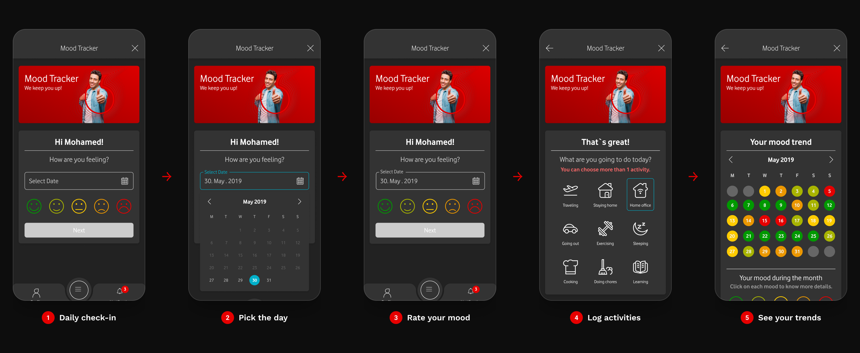
The daily Mood Tracker turns a 20-second check-in into longitudinal wellbeing data — surfacing supportive nudges when employees need them and giving HR an anonymised pulse on the organisation.
18
STAY INFORMED · GET HELP
An Assistant, Not Just a Toolbox
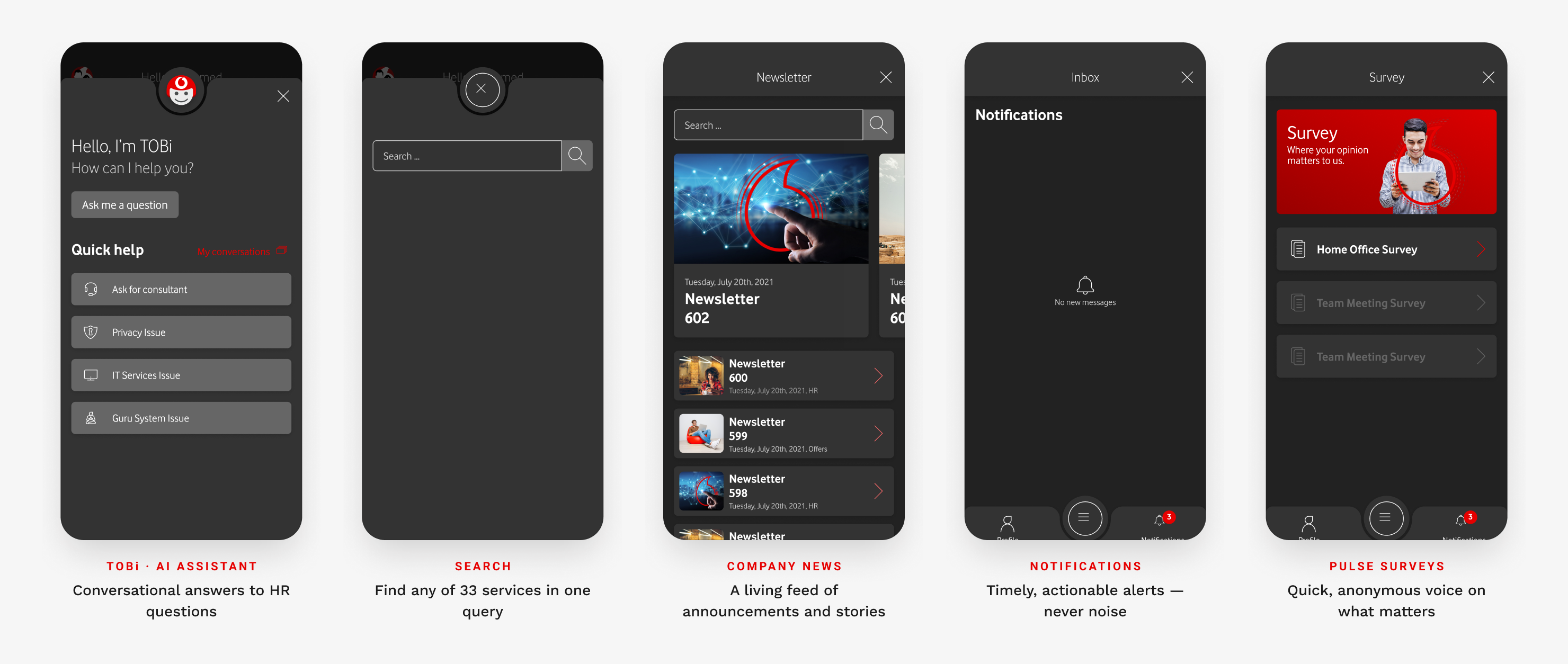
Beyond tasks, the app keeps people connected and supported: company news and photos, push notifications and pulse surveys, instant search, and TOBi — an AI assistant that answers HR questions in plain language.
19
STATES & EDGE CASES
Designing for the Unhappy Path
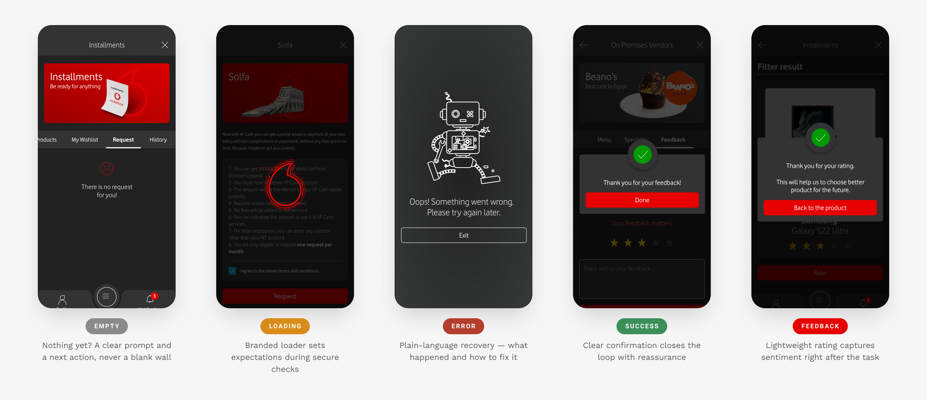
A product is only as good as its worst moment. Every screen ships with empty, loading, error and success states — so the app stays calm and clear even when things go wrong or there's nothing to show.
20
VISUAL POLISH & MICRO-INTERACTIONS
The Craft That Sits on Top of the System
A design system guarantees consistency; polish is what makes it feel considered. This is the layer most case studies skip — the motion tokens, state transitions and component-level detail that separate a merely functional enterprise app from one people are glad to open. Across 100+ screens, those small refinements compound into perceived quality.
MOTION TOKENS · TIMING IS A DESIGN DECISION, NOT A DEFAULT
PRESS FEEDBACK
120ms
Taps and pressed states resolve almost instantly — the app must feel like it answers to the finger, not to a network round-trip.
ENTER & EXIT
250ms
Menus, sheets and platform transitions share one duration, so nothing moves faster or slower than the element beside it.
DATA REVEAL
600ms
Charts and availability counts fill on a custom ease-out — long enough to read as intentional, short enough to never make anyone wait.
Durations and curves are tokenised, not improvised. A single expressive easing — cubic-bezier(.2,.7,.2,1) — governs every reveal in the product, so motion feels authored by one hand rather than assembled screen by screen.
COMPONENT STATE MATRIX · THE PRIMARY BUTTON, FULLY SPECIFIED
Default
Hover
Pressed
Focus
Disabled
No component ships with a single state. Every interactive element is drawn across all five — including a visible focus ring for keyboard and switch-control users — so engineering never guesses, and the experience stays predictable under touch, pointer or assistive input alike.
MICRO-INTERACTIONS THAT EARN THEIR KEEP
Feedback on every touch
Pressed states dip and darken on a 120ms curve, so a tap always feels acknowledged — non-negotiable on the mid-range Android devices much of the workforce carries.
Choreographed reveals
Content rises and fades in as the user scrolls, in reading order — guiding attention down dense enterprise screens instead of dropping everything at once.
Data that animates in
Charts and live counts fill from zero on entry, turning a static figure into a small moment of confidence that the number is current, not cached.
PIXEL-LEVEL SYSTEM · ELEVATION, RADIUS & SPACING ARE TOKENS TOO
ELEVATION · 3 TIERS
Resting, raised and floating shadows map to a component's importance — depth is assigned by role, never dialled in by eye.
CORNER RADIUS
A tight 8 / 12 / 26 scale keeps chips, cards and device frames visually related — not one arbitrary corner in the whole product.
SPACING · 8-PT GRID
Every gap is a multiple of eight — 4, 8, 16, 24 — so vertical rhythm holds identical across 100+ screens and two platforms.
21
INCLUSIVE BY DESIGN
Accessibility as a Design Input, Not a Patch
The fastest way to spot junior work is accessibility treated as a compliance pass at the end. Here it was a starting constraint. In Egypt, Arabic comes first — so the product was architected Arabic-first and mirrored to English, and every component was drawn to clear WCAG 2.1 AA by default. When inclusion is a design input, it costs nothing later; when it's an afterthought, it becomes a rebuild. This was a deliberate choice to design for the whole 6,000-person workforce from the first wireframe.
AR ⇄ EN
Bilingual from the first artboard. Because layouts were built on mirrored auto-layout — not fixed positions — every icon, numeral and flow reflects for right-to-left natively, rather than being force-fitted after the English design was "done".
Arabic-First, Truly Bilingual
RTL wasn't a translation layer — it shaped the layout grid itself. Navigation, iconography and Arabic numerals mirror correctly because the system was designed to flip, so neither language feels like the second-class version.
AA Contrast, by Default
Contrast was a token rule, not a final-pass audit. Text and controls clear WCAG 2.1 AA on every surface — including Vodafone red on light and dark — so accessible colour is impossible to break downstream.
Targets Sized for Real Hands
A 44×44 pt minimum everywhere is a decision about who we design for: shift workers, gloved field engineers, tired thumbs at the end of a long day — not an idealised user on a demo device.
Respects the User's Settings
Layouts reflow when system text is scaled up, honouring a choice the user has already made about their own eyesight — the app adapts to the person, never the reverse.
Never Colour Alone
Meaning is always carried by more than hue. Every icon is paired with a label and every state with text, so the product reads the same for colour-blind users as for everyone else.
Authentication With Options
Fingerprint, Face ID and PIN aren't fallbacks — they're parallel paths, so a worn sensor, an older device or a physical limitation never becomes a locked door to your own payslip.
22
ITERATION & VALIDATION
Refined in Review, Signed Off at the Top
The design evolved through rounds of internal review with HR, product and engineering. Formal end-user testing wasn't part of my engagement — but the delivered design was validated where it counted: the business partner scored it a perfect 10/10.
BUSINESS-PARTNER SCORE
“10 out of 10.” After the design was completed and the product was developed, the Vodafone business partner rated the work top marks — the strongest signal of fit I could ask for ahead of an end-user rollout.
WHAT CHANGED THROUGH ITERATION
OBSERVED
In review, Smart Parking was hard to find — buried in the menu.
CHANGED
Promoted parking into the dashboard's quick actions.
RATIONALE
Surfacing a high-value daily task where people instinctively look.
OBSERVED
The daily mood check-in read as clinical and easy to skip.
CHANGED
Softened the language, added a friendly illustration and an optional note.
RATIONALE
Wellbeing only works if it feels human, not like a form.
OBSERVED
The biometric prompt didn't explain what it unlocked.
CHANGED
Added a one-line explainer and a visible 'use PIN instead' option.
RATIONALE
Trust on a payslip gate comes from clarity, not just security.
23
THE TRANSFORMATION
From Six Logins to Two Taps
The clearest way to judge the work is the day-to-day before and after. The same employee, the same task — a fragmented chore becomes a few seconds on a phone.
LOGINS
6→1
STEPS PER TASK
8+→2
ACCESS
Desktop→Mobile
WELLBEING
None→Daily
BEFORE · THE OLD WAY
A fragmented daily chore
Six separate logins and portals to remember
Phone calls and emails for routine HR asks
Paper forms — printed, signed, scanned, lost
Desktop-only systems, useless on the move
Benefits and entitlements buried in PDFs
No channel for wellbeing or feedback
AFTER · WITH VODAFONERS
Seconds on a phone
One login to a single role-aware home
Every service reachable in two taps
Self-serve in seconds, mobile-first
Benefits surfaced contextually, not hidden
Biometric security built into sensitive flows
A daily mood check-in and pulse surveys
24
IMPACT
Outcomes & Key Achievements
One product replaced a fragmented toolset for the entire Vodafone Egypt workforce — unifying services, standardising the experience across platforms and making wellbeing measurable.
6,000
Employees on it daily
adopted across the workforce
10/10
Business-partner score
on the delivered design
100+
Screens designed
light & dark, two platforms
1,000+
Hours invested
research → production
Shipped & Adopted
The design was developed into a production app and rolled out — now the daily home for 6,000 Vodafone Egypt employees, replacing the legacy tool.
One Hybrid System
A single token-driven design system shipped consistently across Android, iOS and a full dark theme — keeping 100+ screens coherent.
Wellbeing Visibility
The Mood Tracker — one of five features added at the client's request — gave HR its first continuous signal on employee sentiment.
25
REFLECTION
What I'd Carry Forward
Honest lessons from nine months on one product — the things I'd take into the next brief.
Discovery earns the roadmap
The strongest features — the Mood Tracker, Smart Parking — came from research, not the original brief. The weeks spent listening paid back many times over.
A design system is a speed tool
Investing early in tokens and components let me design 100+ screens across two platforms without the experience drifting or slowing down.
Constraints sharpen design
Two platforms, two languages and genuinely sensitive data forced clarity. The hardest constraints consistently produced the cleanest solutions.
Wellbeing belongs in the product
Designing for how people feel — not just what they do — changed how stakeholders understood the app's purpose, and what success meant.
26
WHAT'S NEXT
Where the Product Goes Next
Shipping the super-app was the beginning. The roadmap turns a unified product into an intelligent, proactive one.
NOW
Personalised home
ML-ranked shortcuts that surface each employee's real, most-used services first.
NEXT
Deeper wellbeing loop
Connect mood trends to proactive support and anonymised, team-level insight for managers.
NEXT
Offline & low-connectivity
Cache payslips and bookings for field staff working in patchy coverage.
LATER
Measurement framework
Instrument adoption, task success and NPS to prove impact and steer the roadmap with data.